"Out of One, Many", or: Making Switchable Charts in Power BI with Deneb
As many of you may know, when I’m not tinkering with Power BI visuals on my own time, I do a lot of work with DiscoverEI. A common scenario for our customers can involve visualising a wide range of analytes for their environmental reports.
Our design goals are to make the processes as straightforward as possible for users, so we typically model our reports using fact tables that include the analytes of interest as part of their granularity, and then have a dimension table for the analyte details, which makes slicing and switching really easy for report viewers.
What’s often quite complicated with this process is that not all analytes are created equal, even though the overall ‘shape’ of the data is the same:
- Some have thresholds, in order to be able to check whether they’re within safe limits;
- Some use multiple measures;
- Some need to be visualised differently to others (possibly due to combination of the above or even sometimes down to industry standards or stakeholder preferences).
What We’d Love to Do
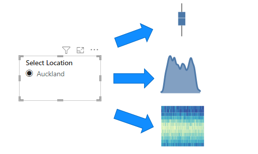
So, for these situations, what would be like to be able to do? The idea of data-driven chart selection sounds pretty cool:
- By selecting a particular analyte in a slicer…
- …the main chart that we’re using could change into a more optimal one…
- …so that it provides the ideal way of visualising our particular analyte.
What We Currently Have
But really, how can that work in Power BI currently? We have the following options (that I’m currently aware of):
- Bookmarks - we could provide bookmarks for each type of chart and allow a user to trigger this, but still relies on them to manually choose the bookmark to view the “correct” chart.
- Personalize Visuals - provide the means for a user to customise the visual, by swapping out the chart and fields themselves. Again, very powerful but if there are specific requirements around how the chart should be displayed, then this still requires manual intervention for our case.
- Calculation groups and fields parameters - very flexible and heaps of resources out there already on how to leverage them, but still relies on the same base chart (just swaps the data available). It’s probably the closest we can get out of the three options here, but still isn’t right for our case.
Until recently, we’ve had to work with these options, but in a chat with Alice Drummond the other day, I started to wonder if Deneb could manage this in the right set of circumstances.
Defining the Challenge
For this case, I’m going to keep things simple(!) by working with the following scenario:
- I have some data for New Zealand that records average temperature by day over many years for many different locations.
- (Fictional) location owners have a preference on how their data should be viewed when their location is selected using a slicer. This could be one of three types of visual:
- Box Plot
- Density Plot
- Heatmap
Managing Location Preferences
Their preferences would look something like the following (although there are many more locations in the model):
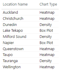
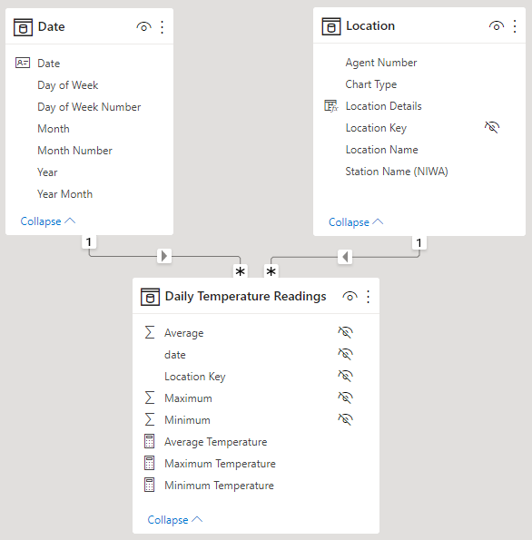
These are added to the table that manages Location, as an attribute (column).
Data Model
Our data model currently looks like this:
The Results
On our page, we have a single select slicer with our Location, and we’ve created a separate visual using Deneb with the following dataset:
- Year Month - date field, representing the start date of each month;
- Average Temperature - our measure, aggregating the average temperature reading at our monthly level of grain;
- Chart Type - our column representing “preference” from the Location table.
I’ve then written a Vega-Lite specification, which will look at the Chart Type and plot the chart according to this value. The video below illustrates the basic concept working within Power BI:
This achieves the desired effect of a data-driven chart using the same visual container and no intervention from the end-user other than changing a slicer.
How It’s Done
The short answer is: it’s done using the layer composition in Vega-Lite. However, due to how layers, axes and scales are unioned in Vega-Lite, it’s a bit more complicated in practice.
I’ll break down my approach in the following sections.
The Individual Charts
To begin with, let’s start with breaking the three types of chart we need into their own simple Vega-Lite specifications:
Box Plot
Our box plot is quite straightforward, using the boxplot mark and breaking this out by the "timeUnit": "month" component of the Year Month field, e.g.:
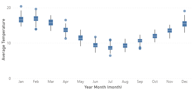
The Vega-Lite specification for this is as follows:
1
2
3
4
5
6
7
8
9
10
11
12
13
14
15
16
17
18
19
{
  "data": { "name": "dataset" },
  "mark": { "type": "boxplot" },
  "encoding": {
    "x": {
      "field": "Year Month",
      "timeUnit": "month",
      "type": "ordinal",
      "axis": {
        "labelAngle": 0,
        "format": "%b"
      }
    },
    "y": {
      "field": "Average Temperature",
      "type": "quantitative"
    }
  }
}
Density Plot
The density plot can be reproduced using Vega-Lite with a density transform:
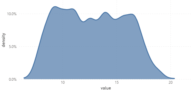
And, here’s our specification for this one:
1
2
3
4
5
6
7
8
9
10
11
12
13
14
15
16
17
18
19
20
21
22
23
{
  "data": { "name": "dataset" },
  "transform": [
    {
      "density": "Average Temperature",
      "bandwidth": 0.4
    }
  ],
  "mark": { "type": "area" },
  "encoding": {
    "x": {
      "field": "value",
      "type": "quantitative"
    },
    "y": {
      "field": "density",
      "type": "quantitative",
      "axis": {
        "format": "0.1%"
      }
    }
  }
}
Heatmap
The heatmap can also be produced with minimal effort in Vega-Lite:
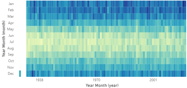
Here’s the Vega-Lite specification for this one, too:
1
2
3
4
5
6
7
8
9
10
11
12
13
14
15
16
17
18
19
20
21
{
  "data": { "name": "dataset" },
  "mark": { "type": "rect" },
  "encoding": {
    "x": {
      "field": "Year Month",
      "timeUnit": "year",
      "type": "quantitative"
    },
    "y": {
      "field": "Year Month",
      "timeUnit": "month",
      "type": "ordinal"
    },
    "color": {
      "field": "Average Temperature",
      "type": "quantitative",
      "legend": null
    }
  }
}
The Conventional Approach
If we’re going to use layers conventionally, then we’re going to run into problems. What I mean, is that if we approach it like this:
1
2
3
4
5
6
7
8
{
  "data": { "name": "dataset" },
  "layer": [
    { boxplot },
    { density },
    { heatmap }
  ]
}
…we’re going to get some funky results, e.g.:
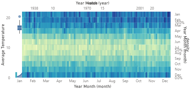
To be fair, we’ve given Vega-Lite a lot of things to resolve and it’s done its best to make it work. Each chart has a different x and y axis to the other, and we can see bits of the other charts poking out from behind the heatmap. This isn’t readable and doesn’t achieve our objective.
(by the way, if you want to see the full specification for this step, rather than the condensed version above, you can expand this section)
{
  "data": {"name": "dataset"},
  "layer": [
    {
      "mark": {"type": "boxplot"},
      "encoding": {
        "x": {
          "field": "Year Month",
          "timeUnit": "month",
          "type": "ordinal",
          "axis": {
            "labelAngle": 0,
            "format": "%b"
          }
        },
        "y": {
          "field": "Average Temperature",
          "type": "quantitative"
        }
      }
    },
    {
      "transform": [
        {
          "density": "Average Temperature",
          "bandwidth": 0.4
        }
      ],
      "mark": {"type": "area"},
      "encoding": {
        "x": {
          "field": "value",
          "type": "quantitative"
        },
        "y": {
          "field": "density",
          "type": "quantitative",
          "axis": {"format": "0.1%"}
        }
      }
    },
    {
      "mark": {"type": "rect"},
      "encoding": {
        "x": {
          "field": "Year Month",
          "timeUnit": "year",
          "type": "quantitative"
        },
        "y": {
          "field": "Year Month",
          "timeUnit": "month",
          "type": "ordinal"
        },
        "color": {
          "field": "Average Temperature",
          "type": "quantitative",
          "legend": null
        }
      }
    }
  ]
}
The Revised Approach
Hey, didn’t we have a Chart Type field that we added to our dataset that’s supposed to make this work?
Yes, we did! And now we’ll start to leverage it.
Filtering Layers
What we can do is ensure that our layers are only rendered if there’s actually data to plot, and we can use a filter transform on each layer to force this.
What I’m also going to do (because the Chart Type is the same for all rows) is extract the first row’s value into a parameter that can be used at a global level. I’m going to call this chart_type_value.
Note that you could bind a parameter directly inside the visual if you wanted to provide user input, but this doesn’t achieve our objective in this scenario.
Our strategy now looks as follows:
1
2
3
4
5
6
7
8
9
10
11
12
13
14
15
16
17
18
19
20
21
22
23
24
25
26
27
28
29
30
31
32
33
34
35
{
  "data": { "name": "dataset" },
    "params": [
    {
      "name": "chart_type_value",
      "expr": "data('dataset')[0]['Chart Type']"
    }
  ],
  "layer": [
    {
      "transform": [
        {
          "filter": "chart_type_value == 'Box Plot'"
        }
      ],
      ...
    },
    {
      "transform": [
        {
          "filter": "chart_type_value == 'Density'"
        }
      ],
      ...
    },
    {
      "transform": [
        {
          "filter": "chart_type_value == 'Heatmap'"
        }
      ],
      ...
    }
  ]
}
In the case of the density layer, this already has a transform property; I’ve removed this to illustrate the filter approach that we need to apply.
(you can expand this section to see the fully fleshed-out specification for this step)
{
  "data": {"name": "dataset"},
  "params": [
    {
      "name": "chart_type_value",
      "expr": "data('dataset')[0]['Chart Type']"
    }
  ],
  "layer": [
    {
      "transform": [
        {
          "filter": "chart_type_value == 'Boxplot'"
        }
      ],
      "mark": {"type": "boxplot"},
      "encoding": {
        "x": {
          "field": "Year Month",
          "timeUnit": "month",
          "type": "ordinal",
          "axis": {
            "labelAngle": 0,
            "format": "%b"
          }
        },
        "y": {
          "field": "Average Temperature",
          "type": "quantitative"
        }
      }
    },
    {
      "transform": [
        {
          "filter": "chart_type_value == 'Density'"
        },
        {
          "density": "Average Temperature",
          "bandwidth": 0.4
        }
      ],
      "mark": {"type": "area"},
      "encoding": {
        "x": {
          "field": "value",
          "type": "quantitative"
        },
        "y": {
          "field": "density",
          "type": "quantitative",
          "axis": {"format": "0.1%"}
        }
      }
    },
    {
      "transform": [
        {
          "filter": "chart_type_value == 'Heatmap'"
        }
      ],
      "mark": {"type": "rect"},
      "encoding": {
        "x": {
          "field": "Year Month",
          "timeUnit": "year",
          "type": "quantitative"
        },
        "y": {
          "field": "Year Month",
          "timeUnit": "month",
          "type": "ordinal"
        },
        "color": {
          "field": "Average Temperature",
          "type": "quantitative",
          "legend": null
        }
      }
    }
  ]
}
Our visual is getting closer to what we want; it will now show the desired chart for the slicer selection, but it still looks a bit messy around the axes, e.g.:
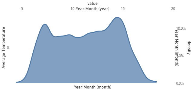
Here, we can still see that even though the other layers aren’t being plotted, Vega-Lite is still reserving the scales and axes for them. This is where we need to get a bit more creative with how our scales are defined and how our axes are drawn.
Fixing the Scales and Axes
If we were writing a custom visual using the visuals SDK and TypeScript, this kind of thing is easy to manage because our visual’s logic could only supply the things we need to the specification. However, as Deneb works with a single specification that needs to accommodate all use cases, then we have to game the system a bit.
We do this by prescribing the following behaviours more explicitly in each layer:
- Using
resolvefor thexandyscales; - Using
orientto explicitly position axes where we want them; - Conditionally formatting axis labels with
labelExpr; - Either hiding the axis titles by setting them to
null, or conditionally setting them using a similar strategy as the labels.
I’m going to deal with each of these in isolation and rather than show the whole specification at each stage, I’ll lay this out fully at the end.
Scale Resolution
This will vary based on the data you’re plotting, but if you see the individual charts not using all available space, we may need to correct the behaviour using this approach.
As we’re only plotting a single chart at a time, we don’t need to worry about uniform scales. We’ll set the x and y channels to resolve independently in the top-level of our specification, e.g.:
1
2
3
4
5
6
7
8
9
10
{
  ...
  "resolve": {
    "scale": {
      "x": "independent",
      "y": "independent"
    }
  },
  ...
}
Axis Orientation
As we’ve observed, Vega-Lite attempts to use the top and right of our visual for additional axes. Normally this would be what we want, but because we’re attempting to make our ‘preferred’ chart appear normally, then we want to explicitly position them using the orient property.
Some of our base charts already have an "axis" object in their "encoding" channels, and we can add to these. For the others, we will need to explicitly add them. Based on the example we’re building here, the "encoding" channels will look as follows:
Box Plot
1
2
3
4
5
6
7
8
9
10
11
12
13
14
15
16
17
18
19
      "encoding": {
        "x": {
          "field": "Year Month",
          "timeUnit": "month",
          "type": "ordinal",
          "axis": {
            "labelAngle": 0,
            "format": "%b",
            "orient": "bottom"
          }
        },
        "y": {
          "field": "Average Temperature",
          "type": "quantitative",
          "axis": {
            "orient": "left"
          }
        }
      }
Density Plot
1
2
3
4
5
6
7
8
9
10
11
12
13
14
15
      "encoding": {
        "x": {
          "field": "value",
          "type": "quantitative",
          "axis": {"orient": "bottom"}
        },
        "y": {
          "field": "density",
          "type": "quantitative",
          "axis": {
            "format": "0.1%",
            "orient": "left"
          }
        }
      }
Heatmap
1
2
3
4
5
6
7
8
9
10
11
12
13
14
15
16
17
18
19
20
21
22
23
      "encoding": {
        "x": {
          "field": "Year Month",
          "timeUnit": "year",
          "type": "quantitative",
          "axis": {
            "orient": "bottom"
          }
        },
        "y": {
          "field": "Year Month",
          "timeUnit": "month",
          "type": "ordinal",
          "axis": {
            "orient": "left"
          }
        },
        "color": {
          "field": "Average Temperature",
          "type": "quantitative",
          "legend": null
        }
      }
With these explicitly set, our axes are positioned correctly. They still look weird, but they’re in the right place:
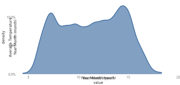
We’ll fix the labels next.
Conditionally Showing the Labels
With axis labels, we can use the labelExpr property to use Vega’s expression language to apply conditional formatting.
In the case of axis labels, we don’t have access to our data rows, as the datum that is exposed here is at the label level. However, because we exposed the Chart Type value via a parameter that is global to the specification (chart_type_value), then we can access this in the label scope 🙂.
For each label, we need to set up a simple ternary expression (which is the same as an if/else) to show the labels if our chart type matches the selected one.
For example, the labelExpr for each axis in the box plot would look as follows:
1
    "labelExpr": "chart_type_value == 'Boxplot' ? datum.label : null"
And once these changes have been propagated to the other axes in the other layers (remembering to use the correct expected value for the chart_type_value!) then only the correct labels will be shown in-context.
Fixing the Titles
This section has two possible approaches: the officially supported one and one that works, but probably shouldn’t (although there is an issue in Vega-Lite’s backlog to implement correctly).
We can therefore either set the axis title to null in all axis objects in each of the layers, and this will hide all titles, e.g.:
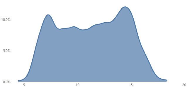
null, Vega-Lite will not display them, effectively cleaning-up our visual.What would be neat is if we could set an expr on the title property. I would note that this sort of works, but not for all mark types. For instance, having the box plot in the spec will cause some unintended behaviour, but could work well if you’re using non-composite marks.
My alternative approach was to create a measure that could be used for the title, and be set based on the current Chart Type value, e.g.:
Chart Type Title =
VAR ChartType =
    MAX ( Location[Chart Type] )
RETURN
    SWITCH (
        TRUE (),
        ChartType = "Heatmap", "Heatmap of Average Temperature (°C) by Month and Year",
        ChartType = "Density", "Density of Average Temperature distribution (°C)",
        ChartType = "Box Plot", "Average Temperature (°C) distribution by Month",
        "No chart preferences specified"
    )
And here’s a short video of how this looks in-situ:
Complete Specification
If you want to have a play with this, I’ve added this to the Data Stories Gallery on the Power BI Community forums.
For anyone keen to explore and adapt, here’s the full specification from this post:
1
2
3
4
5
6
7
8
9
10
11
12
13
14
15
16
17
18
19
20
21
22
23
24
25
26
27
28
29
30
31
32
33
34
35
36
37
38
39
40
41
42
43
44
45
46
47
48
49
50
51
52
53
54
55
56
57
58
59
60
61
62
63
64
65
66
67
68
69
70
71
72
73
74
75
76
77
78
79
80
81
82
83
84
85
86
87
88
89
90
91
92
93
94
95
96
97
98
99
100
101
102
103
104
105
106
107
108
109
110
111
112
113
114
115
116
117
118
119
120
121
122
123
124
125
{
  "data": { "name": "dataset" },
  "params": [
    {
      "name": "chart_type_value",
      "expr": "data('dataset')[0]['Chart Type']"
    }
  ],
  "resolve": {
    "scale": {
      "x": "independent",
      "y": "independent"
    }
  },
  "layer": [
    {
      "description": "Box plot",
      "transform": [
        {
          "filter": "chart_type_value == 'Box Plot'"
        }
      ],
      "mark": { "type": "boxplot" },
      "encoding": {
        "x": {
          "field": "Year Month",
          "timeUnit": "month",
          "type": "ordinal",
          "axis": {
            "title": null,
            "labelAngle": 0,
            "labelExpr": "chart_type_value == 'Box Plot' ? datum.label : ''",
            "format": "%b",
            "orient": "bottom"
          }
        },
        "y": {
          "field": "Average Temperature",
          "type": "quantitative",
          "axis": {
            "title": null,
            "labelExpr": "chart_type_value == 'Box Plot' ? datum.label : ''",
            "orient": "left"
          }
        }
      }
    },
    {
      "description": "Density plot",
      "params": [
        {
          "name": "layer_chart_type",
          "value": "Density"
        }
      ],
      "transform": [
        {
          "filter": "chart_type_value == 'Density'"
        },
        {
          "density": "Average Temperature",
          "bandwidth": 0.4
        }
      ],
      "mark": { "type": "area" },
      "encoding": {
        "x": {
          "field": "value",
          "type": "quantitative",
          "axis": {
            "title": null,
            "labelExpr": "chart_type_value == 'Density' ? datum.label : ''",
            "orient": "bottom"
          }
        },
        "y": {
          "field": "density",
          "type": "quantitative",
          "axis": {
            "title": null,
            "labelExpr": "chart_type_value == 'Density' ? datum.label : ''",
            "format": "0.1%",
            "orient": "left"
          }
        }
      }
    },
    {
      "description": "Heatmap chart",
      "transform": [
        {
          "filter": "chart_type_value == 'Heatmap'"
        }
      ],
      "mark": { "type": "rect" },
      "encoding": {
        "x": {
          "field": "Year Month",
          "timeUnit": "year",
          "type": "quantitative",
          "axis": {
            "title": null,
            "labelExpr": "chart_type_value == 'Heatmap' ? datum.label : ''",
            "orient": "bottom"
          }
        },
        "y": {
          "field": "Year Month",
          "timeUnit": "month",
          "type": "ordinal",
          "axis": {
            "title": null,
            "labelExpr": "chart_type_value == 'Heatmap' ? datum.label : ''",
            "orient": "left"
          }
        },
        "color": {
          "field": "Average Temperature",
          "type": "quantitative",
          "legend": null
        }
      }
    }
  ]
}
Wrapping-Up
Whilst this has taken us a while to get there, I’m hoping that you’ve found the experiment worthwile reading. It’s certainly been an interesting challenge to approach and I’m definitely going to explore this a bit more. It could certainly be interesting to see if we could make this easier in Deneb if this is a case that other people find useful. If anyone has any ideas, please feel free to create an issue for it and we can try and work through how it could potentially work as a feature.
I’m quite excited to see if smarter folks than me can work out if there’s better ways to manage some of the shortcomings I’ve worked around, or if there are more efficient ways to solve this within a single specification. If you have anything you’ve found, please let me know - I’d love to see how this idea can be evolved!
Thanks for reading,
DM-P