
Making "The Mundigl Bullets" with Deneb

I was strolling along LinkedIn the other day, and Kavita Behera’s latest #TheWeeklyChart post was focusing on bullet charts. These posts are always a great read, and promote some fascintating discussion.
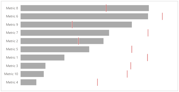
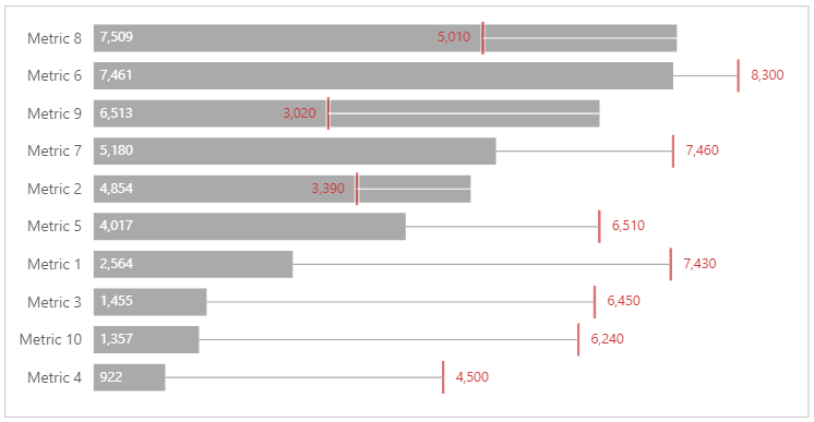
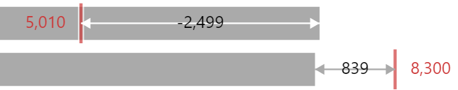
In the comments, there was a reply from Carlos Barboza, which introduced some additional variations on a bullet chart by Robert Mundigl, which is covered and explained at length in this very detailed blog post. Whilst you can see it on either the LinkedIn post or Robert’s blog post, the example looks like this:
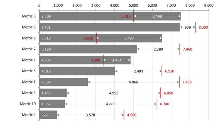
This was produced using Excel, and when I come across new and interesting concepts (to me), if I haven’t seen them in Power BI already, I’m curious to see how I can replicate them, and this one looked like a good challenge for Deneb and Vega-Lite, so let’s have a look at how we can approach this design.
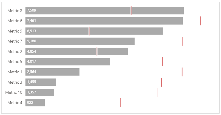
Finished recipe
The approach and method to this is explained in detail below, if you want to know how I worked through the challenge. It’s quite a long read, but if you’re new to Vega-Lite (or even if you’re not), you might learn some tricks to incorporate into your work.
The complete template can be obtained from this Gist if you wish to use it.
Dataset
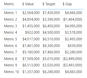
From reading the post, and inspecting the visual, we’ll need a single column, and three measures:
- Metric (our category)
- $ Value
- $ Target
- $ Gap (
[$ Target] - [$ Value]; this could also be done as a transform in the specification)
Breaking-down the approach
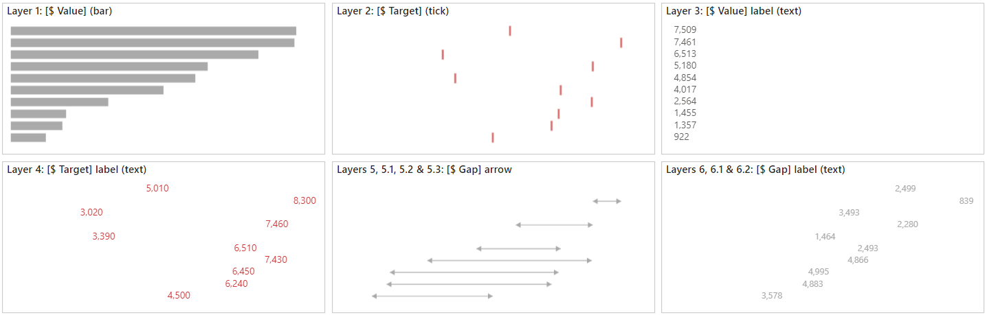
From looking at the design, we can see that we can start with an approach for a regular bar chart, and use the Layer layout system (as axes are shared).
Our layers will need to be drawn in the following order:
- [$ Value] (bar)
- [$ Target] (tick)
- [$ Value] label (text)
- [$ Target] label (text)
- [$ Gap] arrow
5.1 Arrow body (rule)
5.2 Arrow head, [$ Value] anchor (point)
5.3 Arrow head, [$ Target] anchor (point) - [$ Gap] label (text)
6.1 Halo text
6.2 Main text
Nested items mean that we’ll use layers within layers to normalise some of the styling we will need to use. This is how they will look conceptually:
I’ll focus on the approaches for each layer, and any specific logic we need to apply as we go along.
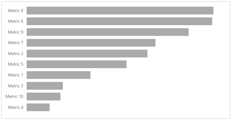
Layer 1: the [$ Value] bar, and initial scales
This first layer sets up a bit more than just the bar mark, so here’s how this looks:
Specification tab
1
2
3
4
5
6
7
8
9
10
11
12
13
14
15
16
17
18
19
20
21
22
23
24
25
26
27
28
29
30
31
32
33
34
35
36
37
{
  "data": { "name": "dataset" },
  "height": { "step": 30 },
  "encoding": {
    "x": {
      "type": "quantitative",
      "axis": null
    },
    "y": {
      "field": "Metric",
      "sort": {
        "field": "$ Value",
        "op": "sum",
        "order": "descending"
      }
    }
  },
  "params": [
    {
      "name": "bar_color",
      "value": "#aaa"
    }
  ],
  "layer": [
    {
      "description": "Main value bar",
      "mark": {
        "type": "bar",
        "color": { "expr": "bar_color" },
        "height": { "band": 0.8 }
      },
      "encoding": {
        "x": { "field": "$ Value" }
      }
    }
  ]
}
After the data property, the first thing we do is set an even step height of 30 pixels. This ensures that our bars are always a specific height, irrespective of how many categories are in our chart, and don’t stretch or shrink to fit the container.
Our encoding object specifies that our x axis is quantitative, meaning that we only need to set this up once. a lot of our layers will have their own x encodings, and we won’t need to repeat it this way. We’re also turning the axis off, as our labels will give us the values we need (in addition to us being able to visually resolve the bar length to get a sense of scale relative to the others). It’s easy enough to turn the axis back on if you prefer to have it.
We also include the y encoding in complete detail, as all layers will use it consistently: each one is scaled to our category column. We’ve also specified that we sort our y-scale in descending order, so our larger bars are at the top. Because we’re using layers, we also need to supply an aggregate, so Vega-Lite resolves the scale appropriately across all layers. In this case, sum is fine (although most common aggregates would work as our dataset grain is one row per data point).
The params section may not make sense right now, but hopefully will later on. Here I’m declaring a parameter called bar_color, with a value of #aaa. I could do this via the Config tab (either as mark config for the bar, or using styles), but we will have some conditional logic later on via expressions, and this provides me with a place I can both declare this once, and be easy to refer to where I need it.
Finally, we have a single layer for our bar. This uses an expression for the color (linked to our param) and sets the height to be 80% of the step width we declared above (0.8). This is so that we have some vertical breathing room with our tick mark in layer 2. Finally, the encoding just binds to the $ Value measure for this row and inherits the rest of the x encoding from the top-level.
Config tab
To finish this step, in the Config tab, I’m going to add the following, to style the view and y-axis:
1
2
3
4
5
6
7
8
9
10
11
12
13
14
15
16
17
{
  "view": { "stroke": "transparent" },
  "font": "Segoe UI",
  "axis": {
    "ticks": false,
    "grid": false,
    "domain": false,
    "title": "",
    "labelColor": "#605E5C",
    "labelFontSize": 12,
    "titleFont": "wf_standard-font, helvetica, arial, sans-serif",
    "titleColor": "#252423",
    "titleFontSize": 16,
    "titleFontWeight": "normal",
    "labelPadding": 10
  }
}
And here’s how we’re looking after these changes:
Layer 2: the [$ Target] tick
Config tab
The first thing we’ll do is set up the following top-level objects for our text mark styling:
1
2
3
4
5
6
7
8
9
10
11
12
13
14
{
  ...
  "tick": {
    "stroke": "white",
    "strokeWidth": 1,
    "thickness": 3
  },
  "style": {
    "target": {
      "color": "#cd3838"
    }
  }
  ...
}
Most styling we can use directly in the tick object, but as I’d like to use the same colour for this plus the label, I’m creating a separate style for that. The stroke and strokeWidth properties are used to apply a small ‘halo’ around the tick, to help with helping it stand out from the bar, and are entirely optional, but can be a useful trick in some situations.
Specification tab
We can now add the following to our layer array, after the first entry for the bars:
1
2
3
4
5
6
7
8
9
10
11
12
13
14
15
16
17
18
19
20
21
{
  ...
  "layer": [
    ...
    {
      "description": "Target tick",
      "mark": {
        "type": "tick",
        "style": ["target"],
        "height": {
          "expr": "bandwidth('y')"
        }
      },
      "encoding": {
        "x": {"field": "$ Target"}
      }
    }
    ...
  ]
  ...
}
Aside from specifying tick as our mark type, I’ve applied the style assignment, so that our color is applied. Additionally, the expression in the height property sets the height to the be same as the step height declared in the initial work we did above. This means that rather than setting an explicit height, if we change our step height, the tick will adjust to fit automatically. As it’s using the entire scale height, the tick sits slightly taller than the bars (which are at 80% height).
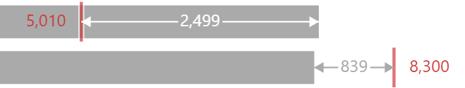
After these changes, our chart now looks as follows:
Layer 3: the [$ Value] label
Config tab
Like above, we’re going to create a specific style entry for the cosmetic elements, called value_label:
1
2
3
4
5
6
7
8
9
10
11
12
{
  ...
  "style": {
    ...
    "value_label": {
      "color": "white",
      "align": "left",
      "dx": 5
    }
  }
  ...
}
In addition to left-aligning the label and giving it a colour, the dx nudges it to the right by 5 pixels, meaning that it’s not going to sit right at the bottom of the bar, so there is the appearance of some padding.
Specification tab
As before, we add a new entry to the layer array for the text mark:
1
2
3
4
5
6
7
8
9
10
11
12
13
14
15
16
17
18
19
20
21
22
{
  ...
  "layer": [
    ...
    {
      "description": "Value label",
      "mark": {
        "type": "text",
        "style": ["value_label"]
      },
      "encoding": {
        "x": {"datum": 0},
        "text": {
          "field": "$ Value",
          "format": "#,###,",
          "formatType": "pbiFormat"
        }
      }
    }
  ]
  ...
}
Here, the mark configuration works much the same way as before, in that binding our style takes care of a lot of the cosmetic aspects.
When encoding, we have some differences to previous layers. Firstly, we bind its x position to the position of the 0 value. Secondly, we’re binding the text value to our field, and then I’m using the a Power BI format string (and using Deneb’s custom formatter to make sure it’s valid) to format the values in thousands.
We now have our label, positioned where we want it:
Layer 4: the [$ Target] label
This layer marks our first foray into conditional expressions, so let’s work this out. The reference design shows the label to the left of the [$ Target] tick mark if over target, and to the right of the tick if underneath it. This provides us with the space for the arrow that bridges the [$ Value] and [$ Target] later.
The easiest way for us to do this is to add some additional data to the dataset that indicates whether the gap value is negative or positive, for convenience purposes. We can add this using DAX and a measure, and that’s fine, but we can reduce the number of dependencies for others using our template by utilising transform in our specification.
Specification tab
Our first change is to introduce the following at the top-level:
1
2
3
4
5
6
7
8
9
10
{
  ...
  "transform": [
    {
      "calculate": "datum['$ Gap'] < 0",
      "as": "gap_is_negative"
    }
  ]
  ...
}
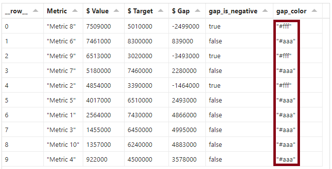
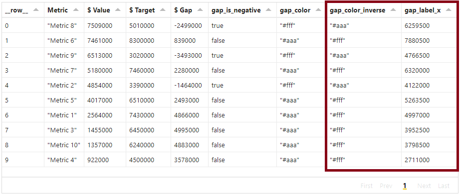
The logic here is that we want to return a true or false value based on the condition (if the [$ Gap] value is less than zero). This will calculate a new column in our data stream, which we can see if we inspect the data_0 dataset in the Data pane (although the name is automatically assigned by Vega-Lite, so may vary for you), e.g.:
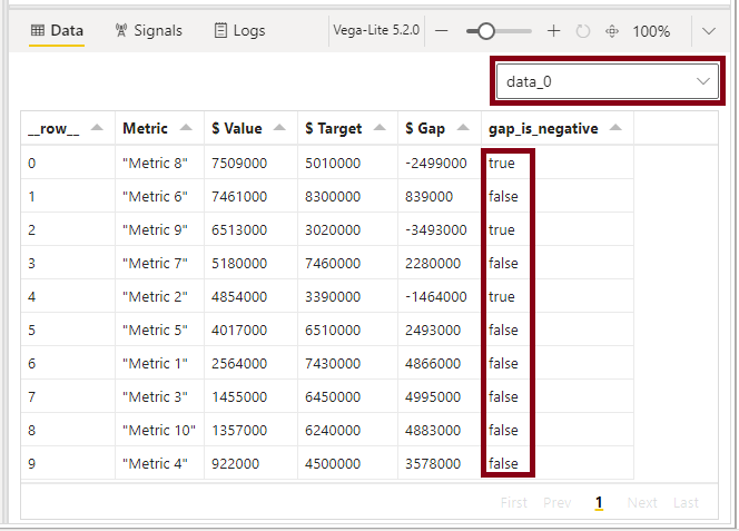
transform operations in a layer's data stream, which is selectable from the Data pane.This now gives us a field in each datum that we can work with more easily.
Much like before, we’ll also add the new layer definition to the array:
1
2
3
4
5
6
7
8
9
10
11
12
13
14
15
16
17
18
19
20
21
22
23
24
25
26
27
28
29
30
31
32
33
34
{
  ...
  "layer": [
    ...
    {
      "description": "Target label",
      "layer": [
        {
          "description": "Target label foreground",
          "mark": {
            "type": "text",
            "style": ["target"],
            "align": {
              "expr": "datum['gap_is_negative'] ? 'right' : 'left'"
            },
            "dx": {
              "expr": "datum['gap_is_negative'] ? -10 : 10"
            }
          }
        }
      ],
      "encoding": {
        "x": {"field": "$ Target"},
        "text": {
          "field": "$ Target",
          "format": "#,###,",
          "formatType": "pbiFormat"
        }
      }
    }
    ...
  ]
  ...
}
Some of this is very similar to the above label (the style assignment, which re-uses an existing one, and the encoding channel is different in all but the field definition, to ensure that it is positioned according to the [$ Target] value for this row).
What is different are the align and dx properties. These are utilising our calculated gap_is_negative field to influence how the mark is formatted. Firstly, the align property will either right or left align the mark so that it’s the correct side of the tick. Then, the dx property will apply a small amount of adjustment in a similar manner (either negative or positive along the x-axis) so it’s not sitting right on top of the tick and makes it easier to resolve.
These expressions are evaluated using the ternary operator, which is a shorthand for if...else. The Vega expression language also has an if() function if you’re more comfortable using that syntax - you can read all about this in the Vega documentation here.
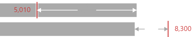
After these changes, we now have our labels sitting where they need to be:
Layer 5: the [$ Gap] arrow
The arrow we need to add to the chart is comprised of three marks: the body, and one for each head. In this layer, we’ll abstract the common parts we’ll need for the styling logic, and then add three nested layers to handle the marks.
Specification tab
We’ll head back up to our transform array and add a new field, which will derive the correct colour to use when encoding our marks, as this will be different, depending on whether they will be placed inside or outside the bar:
1
2
3
4
5
6
7
8
9
10
11
{
  ...
  "transform": [
    ...
    {
      "calculate": "datum['gap_is_negative'] ? '#fff' : bar_color",
      "as": "gap_color"
    }
  ]
  ...
}
Like for layer 4, we can inspect the dataset for our layers to see that we now have a value computed for each row, based on our gap_is_negative calculation, e.g.:
gap_color in the Data pane. This returns a value conditional on the result of the gap_is_negative field.As before, we’ll add another entry to the top-level layer array:
1
2
3
4
5
6
7
8
9
10
11
12
13
14
15
16
17
18
{
  ...
  "layer": [
    ...
    {
      "description": "Gap arrow main layer",
      "encoding": {
        "color": {
          "value": {
            "expr": "datum['gap_color']"
          }
        }
      },
      "layer": []
    }
  ]
  ...
}
This simply binds the color for all marks we’re going to include to the derived gap_color value, so that we don’t have to repeat a bunch of conditional expressions further down.
Layer 5.1: the arrow body (rule)
The arrow body is the most straightforward mark do add, as it’s a rule spanning from [$ Value] to [$ Target].
Specification tab
We’ll add an entry to layer 5’s own layer array as follows:
1
2
3
4
5
6
7
8
9
10
11
12
13
14
15
16
17
18
19
{
  ...
  "layer": [
    ...
    {
      ...
      "layer": [
        {
          "description": "Gap arrow body",
          "mark": {"type": "rule"},
          "encoding": {
            "x": {"field": "$ Value"},
            "x2": {"field": "$ Target"}
          }
        }
      ]
    }
  ]
}
All we’ve done here is specify the mark type, and that the x-coordinates span the fields we want. The color is inherited from the encoding in layer 5’s definition, and we can see that they are shaded accordingly:
rule mark with suitable x and x2 field encodings, we now have a line that spans the two values and is conditionally coloured based on the parent layer's encoding.Layer 5.2: the start arrow
As each arrow head needs to be bound to either the [$ Value] or [$ Target], and these can be different directions, depending on how we’ve met our target, this creates two main possible avenues of attack:
- Bind each mark to a specific field, and conditionally apply the direction of the arrow and its x-offset.
- Create a mark for each end and conditionally bind to the correct field value.
Both approaches are valid, but the second one cuts down on both logic and repetition (and may introduce a cool trick or two for you to use in your own work), so we’re going to use that for this example.
Config tab
We’ll add some generic styling for the point mark type to our config as follows:
1
2
3
4
5
6
7
8
9
{
  ...
  "point": {
    "filled": true,
    "size": 50,
    "opacity": 1
  }
  ...
}
Specification tab
Then, we’ll add a new layer to the end of layer 5’s layer array:
  ...
  "layer": [
    ...
    {
      ...
      "layer": [
        ...
        {
          "description": "Gap arrow head (left)",
          "mark": {
            "type": "point",
            "shape": "triangle-left",
            "xOffset": 3
          },
          "encoding": {
            "x": {
              "value": {
                "expr": "scale('x', datum['gap_is_negative'] ? datum['$ Target'] : datum['$ Value'])"
              }
            }
          }
        }
      ]
    }
  ]
}
It should be straightforward to see that we’ve specified a point mark and given it a shape of triangle-left to make it point the right way.
The xOffset of 3 is a way to nudge the arrows just a little bit to compensate for them sitting directly on top of the tick mark. If you style your gap rule with different colours, you may not find this necessary. Ideally, I would have liked to create a params entry for the [$ Target] tick’s thickness property, but unfortunately this doesn’t currently support expression-based setting, so here I’ve had to repeat myself.
For the x channel encoding, I’m using the value property as this supports expressions, and here I’m asking it to scale the position (using the x-axis scale that Vega-Lite derives) based on [$ Target] if our [$ Gap] is negative, or [$ Value] otherwise. Because the value property results in an explicit pixel-based position, the scale function converts it to the correct value for us, based on the data value. You can read more about this in Vega’s documentation here.
Now, we have our left arrow head:

point mark, and some conditional encoding in the x position channel, we can dynamically bind this to the correct field, based on whether [$ Gap] is negative. Like layer 5.1, this inherits the styling configuration from layer 5, so that it is coloured correctly. Layer 5.3: the end arrow
This is the inverse logic of the work we did in layer 5.2.
Specification tab
The layer array in layer 5 needs one final entry:
  ...
  "layer": [
    ...
    {
      ...
      "layer": [
        ...
        {
          "description": "Gap arrow head (right)",
          "mark": {
            "type": "point",
            "shape": "triangle-right",
            "xOffset": -3
          },
          "encoding": {
            "x": {
              "value": {
                "expr": "scale('x', datum['gap_is_negative'] ? datum['$ Value'] : datum['$ Target'])"
              }
            }
          }
        }
      ]
    }
  ]
}
What’s changed is that firstly we’ve updated the point mark to use triangle-right, and set the xOffset to -3, so it’s the opposite of our start arrow.
Additionally, we’ve swapped the results of the conditional check in the expr, so that the correct field is used to position the arrow head.
And with that, layer 5 is completely finished-up:
Layer 6: the [$ Gap] label
We’re nearly done! The last step is to add our label for the [$ Gap] value. This has a similar challenge to the arrow, but we want to do something a little bit different with our text here, and I’ll demonstrate this up-front so that you can hopefully see where I’m going.
If we were to just add a text mark, and encode its color like the arrow, then it can be a little hard to resolve, e.g.:
text marks are above the rule mark, they do not resolve nicely enough for us and they look like one messy shape.This is still tricky for us, even if we decide to use a single colour like black, e.g.:
We could place a mark between the layers, such as a rect, to try and give the label a starker background, but as the length of our generated text is not easy to measure, this may not look that great. It may work for you, and I wouldn’t discourage you from trying it, but SVG-based text doesn’t quite work the same way as regular HTML, and you can’t easily measure it until after it’s been drawn.
Instead, we’re going to produce a ‘halo’ effect, using another text mark with the same value and properties, which will create some spacing around the outside of the value we want to display. We’ll use two layers for this.
Layer 6.1: the halo text
Specification tab
Firstly, we’re going to need some additional calculations to support our label placement and styling. In the top-level transform array, we’ll add the following:
1
2
3
4
5
6
7
8
9
10
11
12
13
14
15
{
  ...
  "transforms": [
    ...
    {
      "calculate": "datum['gap_is_negative'] ? bar_color : '#fff'",
      "as": "gap_color_inverse"
    },
    {
      "calculate": "datum['$ Target'] - (datum['$ Gap'] / 2)",
      "as": "gap_label_x"
    }
  ]
  ...
}
Our first calculation returns the opposite of the gap_color field, as will serve as our ‘background’ for the label. And then, because our gap label needs to be positioned at the mid-point of our arrow, the second calculation simply calculates the different from target and divides it by 2.
We’ll now see these in our layer’s dataset in the Data pane, e.g.:
We’ll set up layer 6 as follows, by adding the following to the end of the top-level layer array:
  ...
  "layer": [
    ...
    {
      "description": "Gap label main layer",
      "encoding": {
        "x": {"field": "gap_label_x"},
        "text": {
          "field": "$ Gap",
          "format": "#,###,;#,##,",
          "formatType": "pbiFormat"
        }
      },
      "layer": []
    }
  ]
}
Because the [$ Gap] marks we’re producing will use the same value and position, these are shared in the layer 6 encoding channels. The format string is similar to the other labels, but this time I’ve explicitly set the negative values to just show the number as well, rather than the sign. If you prefer to change this, then you can amend as you see fit.
Layer 6.1: the halo label
Now, we’ll start to see the benefits of our work above.
Specification tab
In the layer array in layer 6, we’ll add the following:
1
2
3
4
5
6
7
8
9
10
11
12
13
14
15
16
17
18
19
20
21
{
  ...
  "layer": [
    ...
    {
      ...
      "layer": [
        {
          "description": "Gap label halo (background)",
          "mark": {
            "type": "text",
            "stroke": {
              "expr": "datum['gap_color_inverse']"
            },
            "strokeWidth": 4
          }
        }
      ]
    }
  ]
}
This will create a mark that is the same colour as the ‘background’ (either the bar or the chart background, depending on whether the gap is negative or positive). By setting the stroke, this will colour both the text, and the edges of the text, which takes up a little bit more space than just colouring the text itself. We then make the strokeWidth bigger, to give us even more space for the mark, while respecting the value and formatting.
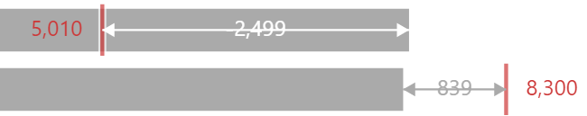
This gives us the following effect in our chart (magnified for comparison purposes to where we point out the contrast challenges above):
Layer 6.2: the display label
This layer focuses on the actual label that our reader is going to see.
Specification tab
Add one more entry to the layer array in layer 6:
1
2
3
4
5
6
7
8
9
10
11
12
13
14
15
16
17
18
19
20
21
{
  ...
  "layer": [
    ...
    {
      ...
      "layer": [
        ...
        {
          "description": "Gap label halo (background)",
          "mark": {
            "type": "text",
            "color": {
              "expr": "datum['gap_color']"
            }
          }
        }
      ]
    }
  ]
}
This is a more straightforward text mark, which will again inherit the text and formatting via the layer 6 encoding channel above it. The only thing we’ve done is to set the color property (not the stroke) to our gap_color value, like for the arrow (although you could use a singular colour if you so wish).
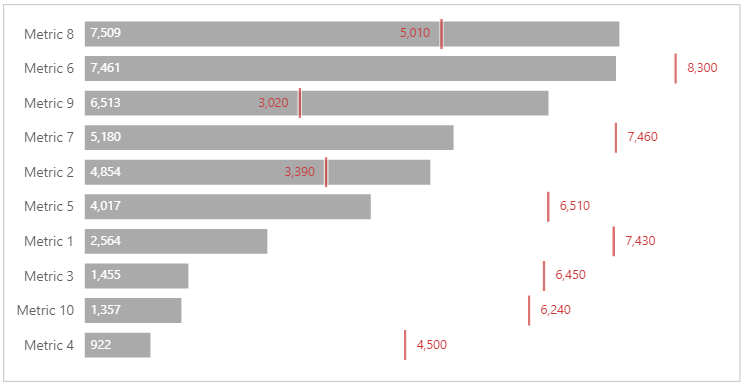
Either way, we get a really nice effect on our labels, where there’s some ‘padding’ before the [$ Gap] arrow:
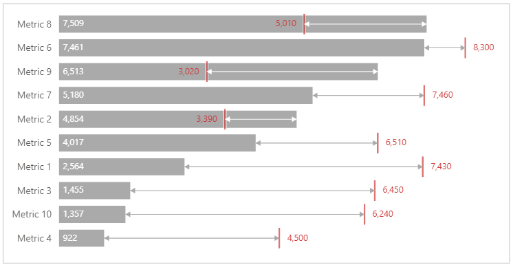
And, here we are all zoomed out:
I certainly loved learning about this variation of a bullet chart, and how I might reconstruct it using Deneb & Vega-Lite in Power BI, and it’s going to be fun thinking about how I could modify this further as needed. And, while this has been a fairly long exercise, I hope that sharing my thought process has helped show some more potential of the languages and given you some thoughts on how they may be able to help you with any potential challenges you’re facing.
If you have any variations or evolutions on this work, then I’d love to see how you’re getting on, or even if you have templates or your own posts to share your findings.
Happy visualising!
DM-P