
A Study on Hills and Valleys in Power BI with Deneb
It’s hard to find the exact name for these types of charts, but Jeff Weir often refers to them as “hill and valley”, and I’m quite taken with that. Either way, they’re a type of line/area chart that uses conditionally shaded areas to highlight variance (typically actual to target). They’re seen a lot in visuals that adhere to IBCS. If anyone wishes to provide me with some guidance on the “right” way to name them, I’m very happy to amend the post accordingly :)
I’ve been meaning to write this one up for a long time, mainly because upon working it out with Deneb earlier this year, the error bar functionality for core visuals was introduced as a public preview came out, and then I tried focus on solving it natively.
[DISCLAIMER] this is a walkthrough, but it’s a lot of work. I’m honestly not sure if there’s an audience for this type of content, but I’ll let you decide as to whether it floats your boat. It was certainly interesting challenge for me and I’ve learned some neat tricks that might be handy for other folks learning to “think visually”. The resulting specification and template could benefit from a lot more work, and this article focuses specifically on the aspect of getting the areas and lines right.
Introduction
Error bars in Power BI have been a really powerful feature for core visuals, and as usual, folks in the community are finding incredibly creative uses for them. Here’s a couple of my recent favourites:
Let me show you a Unicorn. Line Chart visual. Calculation Group. pic.twitter.com/qfqVelKbnR
— Andrzej Leszkiewicz 🇺🇦🇵🇱 (@avatorl) August 17, 2022
Sharing how to do some tricks with Error Bars to get "target areas" in your Power BI line charts.
— Mara Pereira (@datapears) July 29, 2022
Have you tried this #powerbi trick before?
Full tutorial on my latest blog post 👇👇👇https://t.co/7wWE3CMQkj pic.twitter.com/KDzWtjKRY0
Another person who’s been doing a lot of work to expose their potential is Sven Boekhoven:
Difficult to create a shaded area between two lines? Not any more! With the help of Error bars this became really easy.
— Sven Boekhoven (@eSven_nl) August 10, 2022
Have a look at my quick start guide: https://t.co/oTolKl23tc#PowerBI pic.twitter.com/guHAVtNaVb
When I saw this, I was immediately drawn to the top-right chart, and I excitedly thought Sven had cracked the challenge I’ve been trying to solve in Power BI for ages:
“Can we produce a hill and valley chart with core visuals?”
The answer is - as it often is… “it depends”.
You’re not. That’s the way it is https://t.co/2AzUMGe8Yk
— Jeff "It's not a feature, it's a bug" Weir (@InsightsMachine) August 17, 2022
What’s happening here?
Quite simply, the error bar functionality is doing what it’s intended to do: shading the gap between the lines.
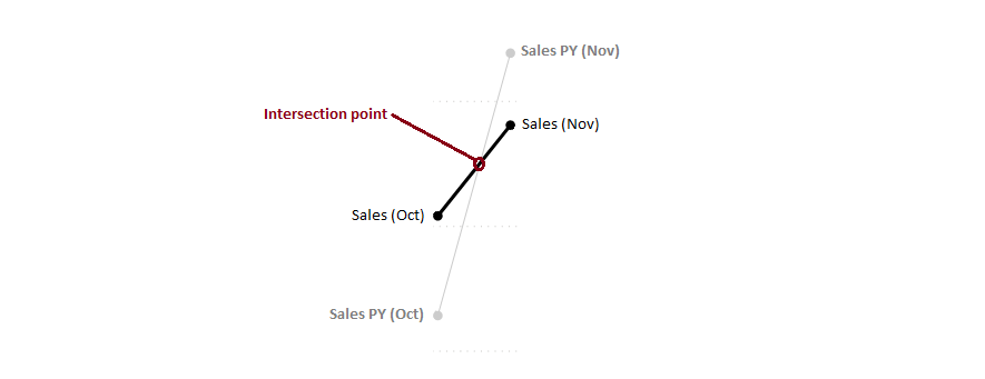
However, the lines have their own “slope” (or gradient) between each data point on the x-axis, and these don’t always line up with the gradient of the line we would need to only shade the inner area. Let’s have a look at this with a more specific example.
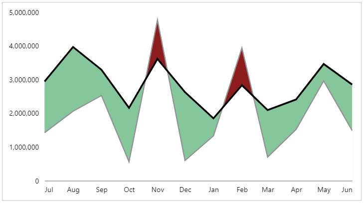
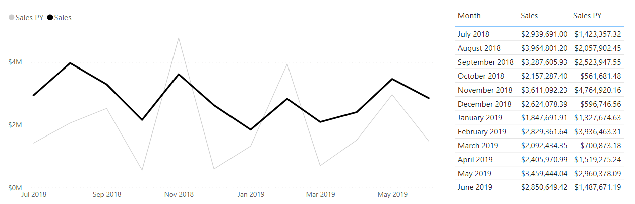
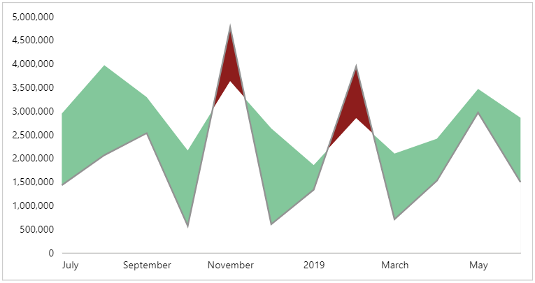
We have a regular old line chart, with our [Month] on the x-axis, and measures for [Sales] and [Sales PY] (previous year):
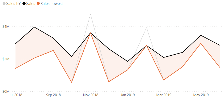
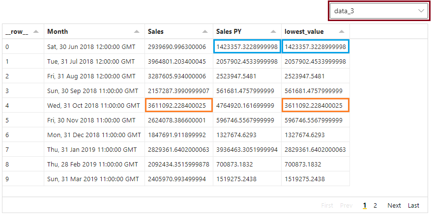
If we create a measure to obtain the lowest value of the two measures for each month and apply this to the upper bound of the error band for our [Sales] measure in the analytics pane (refer to Sven’s excellent post for a walkthrough on this), we can see where things start to go wrong (and I’ve added the measure as a line to help accentuate the effect further):
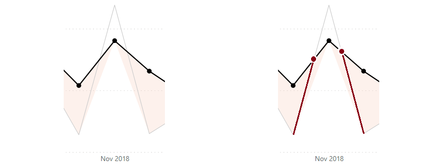
If we overlay the data points for [Sales] as markers, and take a look at the first problem region (October - December), we can zero-in further on the root cause:
So, in order for our shaded area to be correct, we have to interpolate some data points into our visual’s data that exist at the place where our lines intersect. The challenges we face here are numerous:
-
The x-axis for a line chart requires a column from the data model in order to create row context.
-
Because we’re using the month from our date table as the axis value (even if we use a column that uses the month start date for aggregation), the intersection date/time is going to be more finer-grained than this (down to hours, minutes or even seconds if we want to be very precise).
-
We may have multiple intersection points for the same chart (what goes up might come down… or back up again..?)
-
The above points imply that we have dynamic aspects that we need to cater for, and measures are a better fit for this.
This is a real head-scratcher…
As this point, if I’m to solve this with core visuals, I need to find a way to create row context for all months in my visual’s dataset + all derived intersection points that may occur… and that’s something that’s way above my skill level in that particular neck of the woods 😵💫
I did try this first, and I’m sure that someone may be able to do this by using date-level rows and some measures. Sometimes we don’t always succeed and I’m going to share what I do know, and how we can solve it with Deneb and Vega-Lite, which allows more more control over our visual dataset via transforms. Even though the row context is the same, we can create the additional rows in Vega-Lite with the right approach.
As usual, I’d encourage you to read the implementation below, to see where I’m going with the approach (and maybe even find a better way to do it), but if you want the template to start working with, it’s available in this Gist.
A lot of time went into also researching and developing the linear equation work we’re going to cover below in DAX, but have not opted to continue, due to the challenges with visualising this data using the core visuals. However, I appreciate that my DAX knowledge is not the best, so someone else may well be able to excel where I have failed… so maybe it won’t go to waste.
The DAX approach can also be used in lieu of the top-level Vega-Lite transforms, if you prefer to keep everything in-model, but doing it in Vega-Lite makes templating easier, as there are many less dependencies to worry about. I’ve added this as a postscript after the main article, so feel free to read and see if you can make it work. I’d love to know if you do!
Working out the intersection points
At a high-level, I’m going to approach the problem as follows:
-
For each data point (month), there may be an intersection point between our two measures that occurs prior to the next data point (following month).
-
I can use the current row context and following row context to determine if this occurs.
-
Because I’m using a cartesian coordinate system (line chart), I can solve the equations of the gradient produced by the data points between months to work out their intersection coordinates.
-
I can then use these coordinates to create additional data points in my visual later on (once I’ve worked them out).
If we were using Excel, we would have the SLOPE and INTERCEPT formulas to help us, but we don’t have these in DAX, so we’re going to do it all the way from the bottom-up.
Fortunately, the math in this space is very well-established, so it’s time to get re-acquainted with linear equations. I really wish I believed my teachers when they said I may need them one day…
Taking our example above, and focusing on one data point (October) and its subsequent row (November), we can imagine each of our lines as follows:
It’s really easy to find out how to calculate the intersection between two lines. It’s debatable as to whether it’s easy to understand, but I’ll leave the Wikipedia article on it here for those who are interested, and for those who aren’t, I’ll apply it to the example here.
To summarise this, we can use the equation of a straight line:
y = mx + b
Where m is the slope/gradient and b is the y-intercept (where x = zero).
As our chart is at a monthly grain, we can derive the current month’s measure values and the next month’s measure values for each row. These will serve as the reference x/y coordinates for our points of each line, and we will use them to calculate the gradient, and subsequent y-intercept we need for our straight-line equations.
When we have both of these values, we will have an equation for each line in the form y = mx + b, essentially:
[Sales] = ( [Sales Slope] * [Month] ) + [Sales Y-Intercept]
[Sales PY] = ( [Sales PY Slope] * [Month] ) + [Sales PY Y-Intercept]
Because [Month] plays the role of x in our equation, we can solve for when both [Sales] and [Sales PY] are equal, i.e.:
( [Sales Slope] * [Month] ) + [Sales Y-Intercept] = ( [Sales PY Slope] * [Month] ) + [Sales PY Y-Intercept]
And, as the [Month] will be equal, we can rearrange this as follows for each coordinate:
x = ( [Sales PY Y-Intercept] - [Sales Y-Intercept] ) / ( [Sales Slope] - [Sales PY Slope] )
y = [Sales] * ( [Sales PY Y-Intercept] - [Sales Y-Intercept] ) / ( [Sales Slope] - [Sales PY Slope] ) + [Sales Y-Intercept]
You may have noticed that the x-calculation is common to both of these equations, and we’ll take steps to address that also.
Breaking down the Vega-Lite approach
As our view might be to template this solution for other measures, we’re going to think of the [Sales] measure as our actual value, and the [Sales PY] measure as our target value in the design concept. So, anything that we’re going to consider and establish, calculation-wise will use these terms.
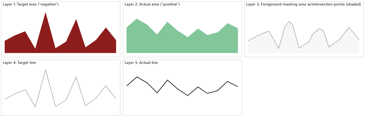
In addition to have to add the linear equation solving to our specification, we need to think about how the layers need to be composed. This one seems simple, but the reality is that you will still need a few layers, drawn in the following order:
- Target area (“negative”; for when actual measure does not achieve target)
- Actual area (“positive”; for when actual achieves target)
- Foreground masking area (including calculated intersection points)
- Target line
- Actual line
The first three layers will create the effect that we want, and this should become apparent as we work through the exercise. Whilst Vega-Lite lets us combine a line with the area marks, we may lose some of the lines as the areas are layered, so we will draw these above everything else. Here’s how they will look conceptually:
Because the majority of our calculations are needed for layer 3, we’ll do the first two layers, so that you can see some progress before we hit the part that is going to slow us down a bit.
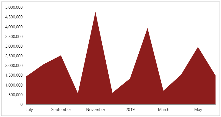
Layer 1: the ‘target’ area
As is typical, the first layer will also set up the axes we need. Firstly I’m going to add my [Month], [Sales] and [Sales PY] fields to my Deneb visual, and create an empty template. I’ll then make my changes for layer 1.
Config tab
I’m going to start out my visual config in a fairly usual way:
1
2
3
4
5
6
7
8
9
10
11
12
13
14
15
16
17
{
  "view": {"stroke": "transparent"},
  "font": "Segoe UI",
  "axis": {
    "title": null,
    "grid": false,
    "ticks": false,
    "labelPadding": 10,
    "labelFontSize": 12
  },
  "axisY": {"domain": false},
  "style": {
    "delta_negative": {
      "color": "#8D1D1C"
    }
  }
}
This just sets up how I’d like my axes to look, as well as setting the default font and removing the borders around the view. I’m also getting straight into defining style entries, as we’re using many similar marks, and we want them to have their own distinct styling. The delta_negative is using a shade of red that is a bit more colour-blind friendly in conjunction with the green were using, and was inspired from The Big Picture (p.45) by Steve Wexler.
Specification tab
Here’ I’ll add-in my boilerplate for the encodings and our first layer:
1
2
3
4
5
6
7
8
9
10
11
12
13
14
15
16
17
18
19
20
21
22
23
24
25
{
  "data": {"name": "dataset"},
  "encoding": {
    "x": {
      "field": "Month",
      "type": "temporal"
    },
    "y": {
      "type": "quantitative"
    }
  },
  "layer": [
    {
      "description": "Target area - background",
      "mark": {
        "type": "area",
        "style": "delta_negative"
      },
      "encoding": {
        "y": {"field": "Sales PY"}
      }
    }
  ]
}
As we’ll be sharing our x and y axes, the encoding channel sets up the most common usage for the dependent layers. Our first layer is then added, and our delta_negative style is applied. We now have our first part ready to go:
Layer 2: the ‘actual’ area
The intention for this layer is to track the value of our actual measure ([Sales]), and it is drawn above the target layer on the screen.
Config tab
We just need to add-in a style entry as follows:
1
2
3
4
5
6
7
8
9
{
  ...
  "style": {
    ...
    "delta_positive": {
      "color": "#83C79B"
    }
  }
}
Specification tab
Our layer configuration is very similar, except for the stlye and y encoding channel bindings, and is added to the end of the layer array:
1
2
3
4
5
6
7
8
9
10
11
12
13
14
15
16
{
  ...
  "layer": [
    ...
    {
      "description": "Actual area - masks out target where necessary",
      "mark": {
        "type": "area",
        "style": "delta_positive"
      },
      "encoding": {
        "y": {"field": "Sales"}
      }
    }
  ]
}
Our visual should now look as follows after we apply the changes:
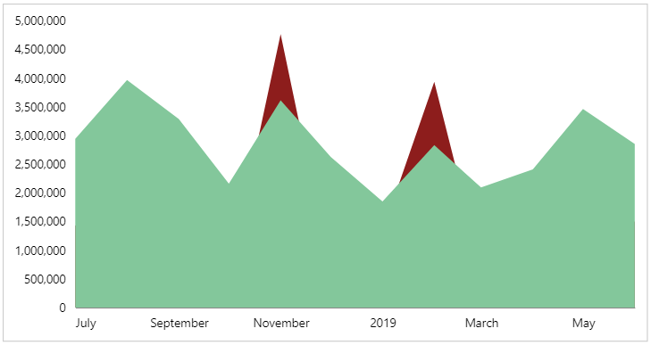
As we can see, where we didn’t hit the target, this still appears from behind the actual layer, but it is masked out when actual exceeds it.
Layer 3: foreground masking area (with intersection points)
We’re now onto the tricky bit - we want this layer to be drawn above the actual layer (2), but contain the intersection points that may exist, in addition to the rows we already have. We’ll use transforms for this - and there will be a few - so that we can step through the stages more easily.
Initial work
First, the easy parts. We’re going to set up our config and add a simple layer in our specification, so that we can build on this as we go.
Config tab
We’ll add in a style entry for our area mark, so that this is ready to go when we finish the changes in the Specification layer:
1
2
3
4
5
6
7
8
9
10
{
  ...
  "style": {
    ...
    "mask_foreground": {
      "color": "#ffffff",
      "stroke": "#ffffff"
    }
  }
}
The color for this style matches my visual’s background colour, so you may need to change this if you’re using a different background for your report. We’re also adding a stroke of the same colour value, so that any of the previous layers don’t bleed through to the foreground also.
Specification tab
We’ll now add a new entry to the layer array, with placeholders for the transforms we’re going to apply, as well as our mark:
1
2
3
4
5
6
7
8
9
10
11
12
13
14
{
  ...
  "layer": [
    ...
    {
      "description": "Masking layer (with interpolated points)",
      "transform": [],
      "mark": {
        "type": "area",
        "style": "mask_foreground"
      }
    }
  ]
}
We’re not adding any encoding channels yet, but by doing this, we will be able to inspect the dataset for this layer in the Data pane (which is going to help us a lot).
Calculating lowest value
For each month in our dataset, we need to calculate which one of these is the lowest value, as this will influence where we need to apply the masking layer for each month in our dataset. We can do this by adding the following entry to the empty transform array we added in the previous step:
1
2
3
4
5
6
7
8
9
10
11
12
13
14
15
16
{
  ...
  "layer": [
    ...
    {
      ...
      "transform": [
        {
          "calculate": "min(datum['Sales PY'] : datum['Sales'])",
          "as": "low_value"
        }
      ],
      ...
    }
  ]
}
In the Data pane, we can select the last data_n entry (where n is a number automatically assigned by Vega-Lite) and inspect the results of these calculations, e.g.:
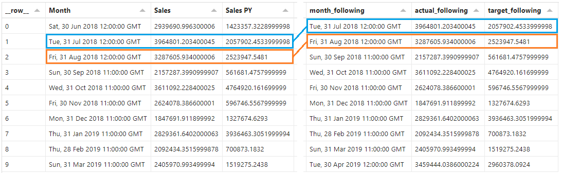
Calculating ‘following’ fields
In order for us to work out the slope and y-intersect for our line segments, we will need to be able to access the following row in our dataset. We’ll add the following group of functions to the end of transform array:
1
2
3
4
5
6
7
8
9
10
11
12
13
14
15
16
17
18
19
20
21
22
23
24
25
26
27
28
29
30
31
32
{
  ...
  "layer": [
    ...
    {
      ...
      "transform": [
        ...
        {
          "window": [
            {
              "op": "lead",
              "field": "Month",
              "as": "month_following"
            },
            {
              "op": "lead",
              "field": "Sales",
              "as": "actual_following"
            },
            {
              "op": "lead",
              "field": "Sales PY",
              "as": "target_following"
            }
          ]
        }
      ],
      ...
    }
  ]
}
This is using a window transform, with a lead operation to access the next row, and extract the [Month], [Sales] and [Sales PY] fields (naming them month_following, actual_following and target_following). Here’s how they should turn out in the Data pane:
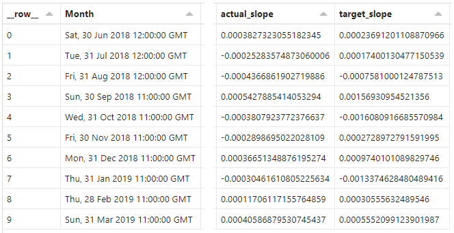
Calculating slope values
As we now have our current and following row details, we can calculate the slope of each line segment.
Specification tab
We’ll now add the following entries to our transform array in layer 3:
1
2
3
4
5
6
7
8
9
10
11
12
13
14
15
16
17
18
19
20
21
{
  ...
  "layer": [
    ...
    {
      ...
      "transform": [
        ...
        {
          "calculate": "(datum['actual_following'] - datum['Sales']) / (datum['month_following'] - datum['Month'])",
          "as": "actual_slope"
        },
        {
          "calculate": "(datum['target_following'] - datum['Sales PY']) / (datum['month_following'] - datum['Month'])",
          "as": "target_slope"
        }
      ],
      ...
    }
  ]
}
These use the slope formulas identified above, and all we’re doing is substituting in the values that apply. We’ll now get two additional columns in the dataset in the Data pane, e.g.:
Even though our x-axis uses date/time, these get converted to numeric representations internally, so can be subtracted from each other just fine 👍
The resulting columns show our slope value, and a positive value represents a “rising” line (moving away from the x-axis), whereas a negative value represents a “falling” line (moving towards the x-axis).
Calculating y-intersect values
Specification tab
Now that we have our slope values, we can calculate the y-intersect values. Similar to above, we add two more entries to the transform array:
1
2
3
4
5
6
7
8
9
10
11
12
13
14
15
16
17
18
19
20
21
{
  ...
  "layer": [
    ...
    {
      ...
      "transform": [
        ...
        {
          "calculate": "datum['Sales'] - (datum['actual_slope'] * datum['Month'])",
          "as": "actual_y_intercept"
        },
        {
          "calculate": "datum['Sales PY'] - (datum['target_slope'] * datum['Month'])",
          "as": "target_y_intercept"
        }
      ],
      ...
    }
  ]
}
As before, we can see the results in the Data pane, e.g.:
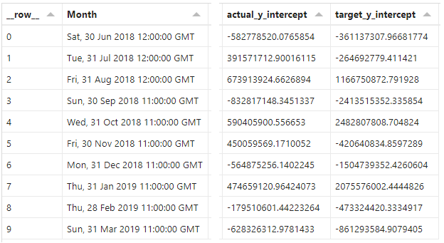
These represent the values for each measure where x ([Month]) = 0. These can be quite extreme, relative to our current measure values because the zero for date/time is 1st Jan 1970. The scale doesn’t matter though, as long as we know that we have the right components of our straight line equation.
Calculating intersect points
Now that we have our components, we can calculate the x and y coordinates of where our line segments will intersect.
As we mentioned above, the formulas to calculate the coordinates reuse some common logic, so we’ll create two calculations we can re-use, and then two for each coordinate. Again, we’ll add these to the transform array:
1
2
3
4
5
6
7
8
9
10
11
12
13
14
15
16
17
18
19
20
21
22
23
24
25
26
27
28
29
{
  ...
  "layer": [
    ...
    {
      ...
      "transform": [
        ...
        {
          "calculate": "(datum['target_y_intercept'] - datum['actual_y_intercept']) / (datum['actual_slope'] - datum['target_slope'])",
          "as": "intersect_base"
        },
        {
          "calculate": "datum['intersect_base'] > datum['Month'] && datum['intersect_base'] < datum['month_following']",
          "as": "intersect_before_following"
        },
        {
          "calculate": "datum['intersect_before_following'] ? datetime(datum['intersect_base']) : null",
          "as": "intersect_x"
        },
        {
          "calculate": "datum['intersect_before_following'] ? (datum['actual_slope'] * datum['intersect_base']) + datum['actual_y_intercept'] : null",
          "as": "intersect_y"
        }
      ],
      ...
    }
  ]
}
It should be apparent from the sample output below, but here’s what we did:
-
intersect_base: calculated the x-coordinate where the line segments will intersect. This is resolved to a number representing the timestamp where this will occur. -
intersect_before_following: evaluated whether the intersection point falls between the current and following month as atrue/falsevalue. We are only interested in the events where this istrue(we have to plan for an intersection point between months). -
intersect_x: resolved the x-coordinate we wish to utilise fromintersect_base, if the intersection occurs between rows (nullif it doesn’t). Because this is a number, we wrap this with adatetime()function, to convert it back into a valid date/time. -
intersect_y: resolve the y-coordinate for the intersect, based on the x-coordinate (intersect_base). Again, we test to see if the intersection occurs between months, and only evaluate the measure value if this istrue(nullif it’sfalse).
Here’s how these should look in the Data pane for our layer’s dataset:
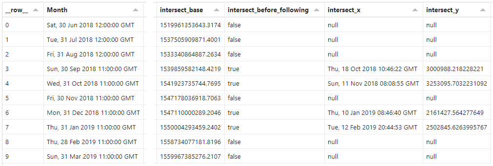
Due to the conversion from intersect_base, we can see the exact date and time that an intersection would occur, and that this is between the Month and the following_month. We can make a similar observation with the calculated y_intersect value and our measures.
Now we have the values we need to interpolate, we need to create the additional rows.
Folding the intersects and generating new rows
We had to do a lot to get here, but this is where things start to pay off. We’ll add the following to the end of our (very long) transform array:
1
2
3
4
5
6
7
8
9
10
11
12
13
14
15
16
17
18
19
20
{
  ...
  "layer": [
    ...
    {
      ...
      "transform": [
        ...
        {
          "fold": [
            "Month",
            "intersect_x"
          ]
        },
        {"filter": "datum['value'] !== null"}
      ],
      ...
    }
  ]
}
The fold transform is pretty nifty, and you can think of it much like an unpivot transform in Power Query. We’re passing in the two columns that we want to use as our new level of grain, and Vega-Lite will produce new rows of key/value pairs (plus the other fields for the row) to support this structure. We’re able to alias the column names, but we’re leaving the defaults, and they will have the following structure:
key: the name of the column being folded (either"Month"or"intersect_x")value: the value from the original column (which will be a date/time value).
We apply a filter transform to remove the values where the resulting value is null (no intersection date that falls between current and following month).
This gives us a dataset with a few more rows than before, e.g.:
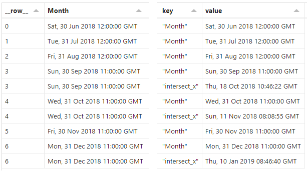
In our dataset, all existing fields are cloned, and we can see there are duplicates for some of the rows, although the values we want (key & value) are unique. We will need to do one more thing to get the resolved x/y values for our area mark, and this will be the last thing we need to do.
Resolving the final x/y values for our interpolated area
Our last step on a very long journey for this layer’s transforms effectively selects the correct value to use for the x and y encodings that we need for our area. It’s been a slog to get here, but hopefully illustrates the scale of the challenge we’re facing to get these nice, shaded areas…
We will add our last two calculations to the transform array:
1
2
3
4
5
6
7
8
9
10
11
12
13
14
15
16
17
18
19
20
21
{
...
"layer": [
...
{
...
"transform": [
...
{
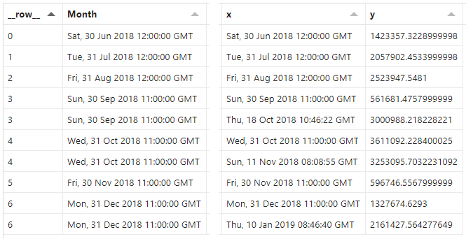
"calculate": "datum['key'] === 'Month' ? datum['Month'] : datum['intersect_x']",
"as": "x"
},
{
"calculate": "datum['key'] === 'Month' ? datum['lowest_value'] : datum['intersect_y']",
"as": "y"
}
],
...
}
]
}
Both of these simply look at the value in our key column, and return the correct value to use:
-
For
x, this is the value of the [Month] column if it corresponds with an original row from our dataset. If it doesn’t we use the calculated intersection value (intersect_x). -
For
ythis is the value of thelowest_valuecalculation if it corresponds with an original row from our dataset. If it doesn’t we use the calculated intersection value (intersect_y).
And the final two columns in our dataset is what our work has yielded, e.g.:
Updating the layer encodings
Specification tab
All(!) we now need to do is update the encoding channel for this layer with the calculated values:
1
2
3
4
5
6
7
8
9
10
11
12
13
{
  ...
  "layer": [
    ...
    {
      ...
      "encoding": {
        "x": {"field": "x"},
        "y": {"field": "y"}
      }
    }
  ]
}
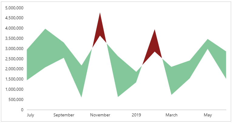
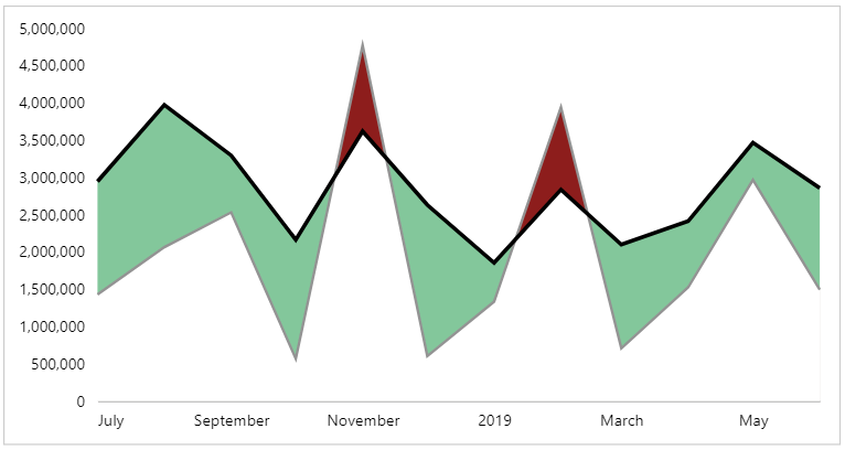
And, when we apply our changes, we get our hills and valleys 🙂
We’ll now focus on the final two layers, which are (thankfully) much more straightforward.
Layer 4: the target line
Because we’re using layers to do our masking, it’s better that we draw our lines over the top, so that they’re clearly defined.
Config tab
Much like for the other marks, we’ll add a style property for our target line:
1
2
3
4
5
6
7
8
9
10
{
  ...
  "style": {
    ...
    "target_line": {
      "color": "#939393",
      "strokeWidth": 2
    }
  }
}
This will colour our line in a mid-tone grey when it’s plotted.
Specification tab
We can now add a new layer to the end of the top-level layer array:
1
2
3
4
5
6
7
8
9
10
11
12
13
14
15
16
{
  ...
  "layer": [
    ...
    {
      "description": "Target line",
      "mark": {
        "type": "line",
        "style": "target_line"
      },
      "encoding": {
        "y": {"field": "Sales PY"}
      }
    }
  ]
}
We now get a line that follows the target measure ([Sales PY]):
Layer 5: the actual line
The last mark we need is our line to show our actual ([Sales]) measure, and this follows the pattern for the previous layer.
Config tab
Again, we apply a style for our line:
1
2
3
4
5
6
7
8
9
10
{
  ...
  "style": {
    ...
    "actual_line": {
      "color": "#000000",
      "strokeWidth": 3
    }
  }
}
The intention here is that we have a more solid black line, and it’s slightly thicker than our target line.
Specification tab
We add our final mark to the top-level layer array:
1
2
3
4
5
6
7
8
9
10
11
12
13
14
15
16
{
  ...
  "layer": [
    ...
    {
      "description": "Actual line",
      "mark": {
        "type": "line",
        "style": "actual_line"
      },
      "encoding": {
        "y": {"field": "Sales"}
      }
    }
  ]
}
This only differs to layer 4 in the style and y encoding bindings. And, upon applying our changes, we get the full effect:
Some final cosmetic tweaks
From this point, we could probably go nuts with improving further, but this article has covered enough ground. The last small change I’m going to make is to apply some additional styling and formatting to my axes by amending the top-level encoding channels to the following:
1
2
3
4
5
6
7
8
9
10
11
12
13
14
15
16
17
18
{
  ...
  "encoding": {
    "x": {
      "field": "Month",
      "type": "temporal",
      "axis": {
        "zindex": 1,
        "format": "%b"
      }
    },
    "y": {
      "type": "quantitative",
      "axis": {"tickCount": 5}
    }
  },
  ...
}
A short summary of what I’ve done here is as follows:
-
For the x-axis, I’ve brought it to the top of the canvas, above the marks (
zindex= 1), so that the masking area is not completely obstructing the domain line. I’m also applying formatting to show the abbreviated month (using D3 syntax rather then the custom Power BI formatter), as in this case I’m always looking at a single financial year. -
For the y-axis, I’ve fixed the tick count so that the labels are a bit less dense.
And here’s where I’m leaving things for now:
Wrapping-up
Well, I hope that you stuck with me to this point, have enjoyed the journey, and may even have a few ideas of your own!
As mentioned above, this has been an interesting study for me, and this is probably more of a jumping-off point for further designs. It’s certainly taught me that some powerful effects that (while they might look simple) can be the product of a decent amount of development work to get it working nicely for your readers.
This is definitely a lot of effort to go to, but hopefully the template for this work may help expedite this for anyone who wishes to push it further, or come up with more effective and efficient means to replicate the approach. Please let me know if you do find anything out, of if you’re able to use this in your own designs - as always, I’d love to hear from you if you’re getting stuff done with Deneb.
Thanks as always for reading,
DM-P
Postscript: Attempting the linear algebra via DAX
As discussed above, you can do the linear algebra with DAX, and because this formed a lot of my initial research for this article, I have left it in for anyone who may find it useful, or wish to attempt (and hopefully succeed) where I have failed.
I have a feeling that this could be done more elegantly by using calculation groups, but we’re already throwing enough at you without having to worry about them too. For the purposes of illustration, we’ll do everything with regular measures inside Power BI Desktop.
I have a simple data model, but key to this are the following features:
- I have a [Date] table in which I have a [Month] column. This gives all date records the start of month value as a date type, e.g.:
- I have a [Sales] table with all of my sales transactions.
- There are some other dimension tables, but they aren’t relevant to the calculations we’re going to be doing (and they should support slicing and dicing by these other dimensions).
Our sales measures are defined as follows:
Sales =
SUM ( Sales[Sales Amount] )

Sales PY =
CALCULATE ( [Sales], DATEADD ( 'Date'[Date], -1, YEAR ) )
Supporting measures for Date logic
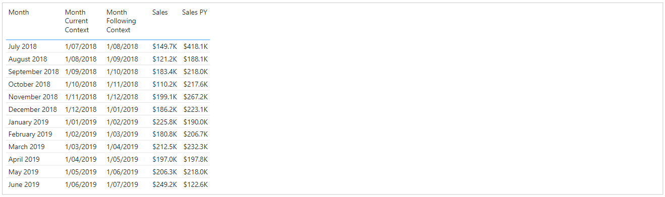
As mentioned above, the [Month] column aggregates the visual dataset to a monthly grain, and is date-types, so will aggregate our measures at the correct level of detail. That being said, I’m going to depend on it a few times, so I’m also going to declare a measure that handles the aggregation at the row-level we need:
Month Current Context =
MAX ( 'Date'[Month] )
And, a measure to get the following Month’s date:
Month Following Context =
CALCULATE ( [Month Current Context], DATEADD ( 'Date'[Date], +1, MONTH ) )
If we add these to a table visual, with our existing dataset fields, we have the following:
Supporting Sales measures
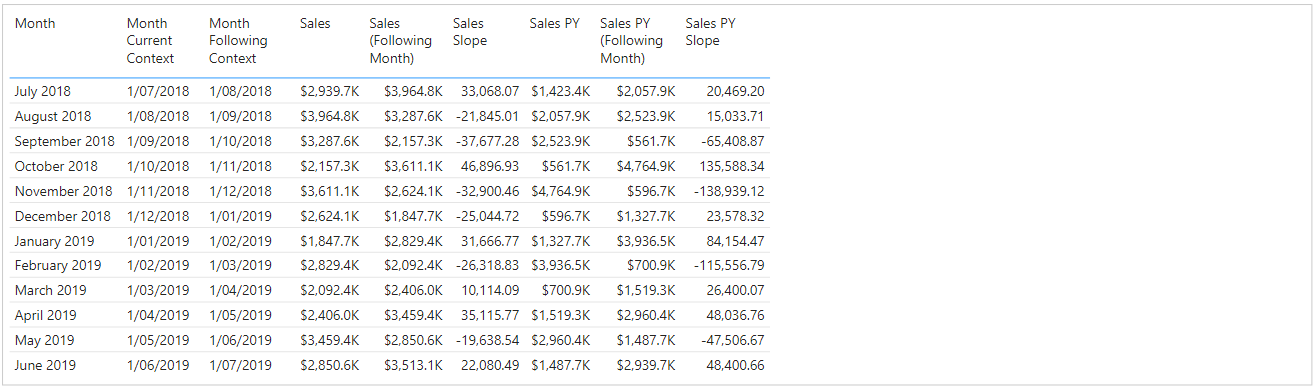
We can now use these measures to derive the ‘following month’ values for each of our base measures:
Sales (Following Month) =
CALCULATE ( [Sales], DATEADD ( 'Date'[Date], +1, MONTH ) )

Sales PY (Following Month) =
CALCULATE ( [Sales PY], DATEADD ( 'Date'[Date], +1, MONTH ) )
Now we have a way of accessing the next row’s values, e.g.:
Calculating the slope of each line segment
We can now use these measures to create further measures that will derive the slope for our [Sales] and [Sales Y] lines:
Sales Slope =
VAR Numerator = [Sales (Following Month)] - [Sales]
VAR Denominator = [Month Following Context] - [Month Current Context]
RETURN
    DIVIDE ( Numerator, Denominator, BLANK () )

Sales PY Slope =
VAR Numerator = [Sales PY (Following Month)] - [Sales PY]
VAR Denominator = [Month Following Context] - [Month Current Context]
RETURN
    DIVIDE ( Numerator, Denominator, BLANK () )
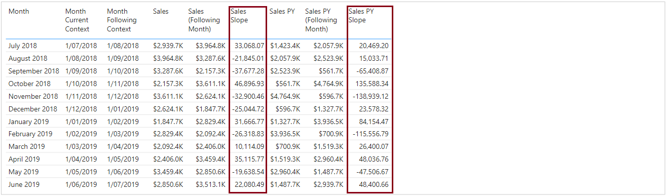
We can now see that we have a slope value for each measure. A negative value means the line “falls” (higher to lower value), whereas a positive value indicates a “rise” (lower to higher”).
What’s cool is that even though we might normally use numbers, Date/time values support arithmetic, so our values will be correct.
Calculating the y-intercept of each line segment
Our final component to be able to calculate the coordinates of our points is the y-intercept, which is the y (or measure) value that would be present if x (or [Month]) = 0:
Sales Y-Intercept =
[Sales] - ( [Sales Slope] * [Month Current Context] )

Sales PY Y-Intercept =
[Sales PY] - ( [Sales PY Slope] * [Month Current Context] )
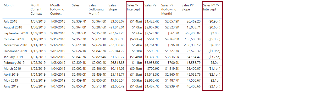
These numbers will be quite extreme - relative to the measures - as, we’re looking at such a small window of time, and time = 0 is quite a large span! Either way, we know how our straight line projects, and we now have all the moving parts to calculate our intersection points.
Calculating the intersection points
As we mentioned above, the formulas to calculate the coordinates reuse some common logic, so we’ll create three measures: one for this centralised calculation, and then one each for the x ([Month]) and y (measure) values where intersection could occur:
Sales Intersection (Base) =
DIVIDE (
    [Sales PY Y-Intercept] - [Sales Y-Intercept],
    [Sales Slope] - [Sales PY Slope],
    BLANK ()
)

Sales Intersection (x) =
VAR Point =
    CONVERT ( [Sales Intersection (Base)], DATETIME )
RETURN
    IF (
        Point > [Month Current Context]
            && Point < [Month Following Context],
        Point
    )

Sales Intersection (y) =
VAR Point = ( [Sales Slope] * [Sales Intersection (Base)] ) + [Sales Y-Intercept]
RETURN
    IF ( [Sales Intersection (x)], Point )
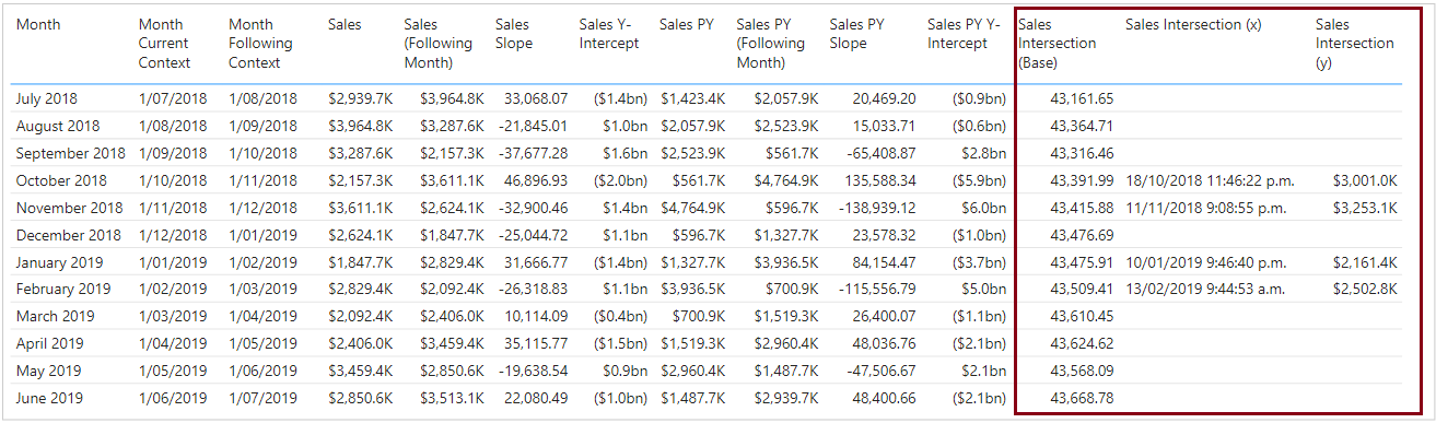
The [Sales Intersection (Base)] measure returns a numeric value, representing the date and time of an intersection point, and is essentially the x-value. However, because an intersection point may occur outside the range of our line segment, the logic in the [Sales Intersection (x)] and [Sales Intersection (y)] measures ensures that if this is outside the range, then a BLANK() value is returned, and we only see results in the output where we may need such a point to be plotted.
And this is where I got to before deciding to change tack to what’s documented up-top, so if yo wish to attempt to take it further…
