
Using luminance in Vega-Lite with Deneb
Brian Julius’s recent LinkedIn post highlighted a great blog post by Ed Freeman, where Ed uses an answer by Ilmari Karonen on a Graphic Design Stack Overflow question. The solution uses DAX to produce a means to correct the font colour in a Power BI table based on a background colour. It’s a fantastic solution to a common challenge with making another element be responsive to the properties of another, and definitely something folks should consider adding to their DAX toolbelt as a means of improving accessibility in their reports.
This is something that users of Deneb may be keen to replicate in their work, and the good news is, you can do it without the dependency of a DAX measure, if you’d prefer to use that approach.
I write about making use of Vega expressions in a number of other posts, but both Vega and Vega-Lite, but I always think it’s worth pointing out their existence as much as possible - they are a way of extending an already very extensible set of visual languages, and I would recommend getting familiar with them. Vega-Lite has a lot of places where expressions can be used to do cool dynamic stuff with your designs.
In this case, a lot of Ed’s logic to work out the luminance is already available in the form of the luminance function, which is calculated according to W3C Web Content Accessibility Guidelines. All we need to do is adapt this, and we’re good to go. I’ll provide a worked example below that can illustrate how we might use this.
Our example chart
Let’s say we have the following bar chart. This chart uses a text mark to make it more compact and move the column we’re using for the y axis on top of the mark, rather than using space for the axis. This has a simple blue colouring and sorts our locations in descending order of temperature:
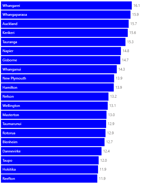
For those who wish to see the specification in-full, you can expand here to get it. The chart uses three marks: one for the bar, one for the data label and one for the location label.
{
  "height": {"step": 30},
  "data": {"name": "dataset"},
  "layer": [
    {
      "mark": {
        "description": "Bar for each location",
        "type": "bar",
        "color": "blue"
      },
      "encoding": {
        "x": {
          "field": "Average Temperature"
        }
      }
    },
    {
      "description": "Temperature label",
      "mark": {
        "type": "text",
        "align": "left",
        "dx": 5
      },
      "encoding": {
        "x": {
          "field": "Average Temperature"
        },
        "text": {
          "field": "Average Temperature",
          "format": ".1f"
        }
      }
    },
    {
      "mark": {
        "description": "Location label",
        "type": "text",
        "align": "left",
        "dx": 5,
        "color": "white"
      },
      "encoding": {
        "x": {"datum": 0},
        "text": {
          "field": "Location Name"
        }
      }
    }
  ],
  "encoding": {
    "y": {
      "field": "Location Name",
      "type": "nominal",
      "axis": null,
      "sort": {
        "field": "Average Temperature",
        "op": "mean",
        "order": "descending"
      }
    },
    "x": {
      "field": "Average Temperature",
      "type": "quantitative",
      "axis": null
    }
  }
}
Adding a gradient
We’ve fixed the bar and the location label colours at blue and white respectively, but let’s say we want to make our bar colour assignment a gradient, like below? We can do this by swapping the color property in our bar mark for a color encoding channel, e.g.:
1
2
3
4
5
6
7
  ...
  "color": {
    "field": "Average Temperature",
    "type": "quantitative",
    "legend": null
  }
  ...
(for those who want the entire specification with this change applied, expand this section)
{
  "height": {"step": 30},
  "data": {"name": "dataset"},
  "layer": [
    {
      "mark": {
        "description": "Bar for each location",
        "type": "bar"
      },
      "encoding": {
        "x": {
          "field": "Average Temperature"
        },
        "color": {
          "field": "Average Temperature",
          "type": "quantitative",
          "legend": null
        }
      }
    },
    {
      "description": "Temperature label",
      "mark": {
        "type": "text",
        "align": "left",
        "dx": 5
      },
      "encoding": {
        "x": {
          "field": "Average Temperature"
        },
        "text": {
          "field": "Average Temperature",
          "format": ".1f"
        }
      }
    },
    {
      "mark": {
        "description": "Location label",
        "type": "text",
        "align": "left",
        "dx": 5,
        "color": "white"
      },
      "encoding": {
        "x": {"datum": 0},
        "text": {
          "field": "Location Name"
        }
      }
    }
  ],
  "encoding": {
    "y": {
      "field": "Location Name",
      "type": "nominal",
      "axis": null,
      "sort": {
        "field": "Average Temperature",
        "op": "mean",
        "order": "descending"
      }
    },
    "x": {
      "field": "Average Temperature",
      "type": "quantitative",
      "axis": null
    }
  }
}
This will update our visual as follows:
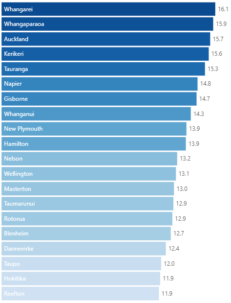
This makes the bars look nice, but now we’re struggling to read the location labels at the bottom. We’ll now make use of expressions to rectify that.
Fixing the labels using luminance
The challenge with quantitative scales is that colour changes are gradual from one value to another, so we will need to approach as follows:
- Calculate what each location’s colour value is, based on this scale.
- If the luminance is above the desired threshold, apply our dark colour; apply our light colour if below the threshold.
Vega expressions also allow us to use the scale function to pass in a named scale (in this case the color encoding used in the visual) and a value against this scale (which will be our Average Temperature value), to evaluate what Vega-Lite has computed for it.
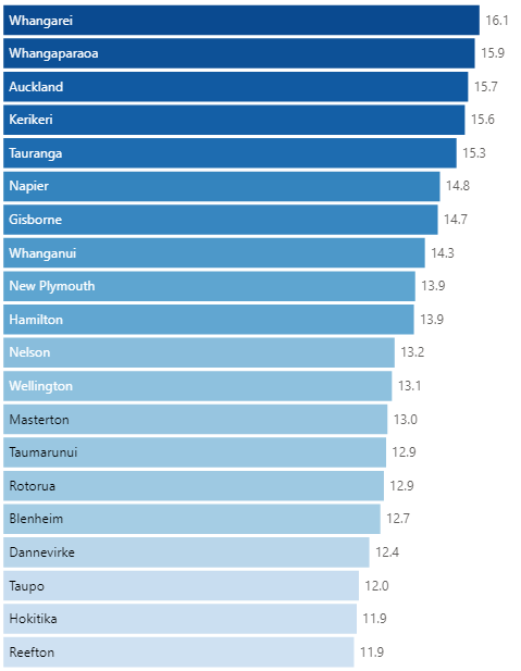
We can therefore update the color property for the Location label as follows:
1
2
3
  "color": {
    "expr": "luminance ( scale ( 'color', datum['Average Temperature'] ) ) > 0.5 ? 'black' : 'white'"
  }
(for those who want the entire specification with this change applied, expand this section)
{
  "height": {"step": 30},
  "data": {"name": "dataset"},
  "layer": [
    {
      "mark": {
        "description": "Bar for each location",
        "type": "bar"
      },
      "encoding": {
        "x": {
          "field": "Average Temperature"
        },
        "color": {
          "field": "Average Temperature",
          "type": "quantitative",
          "legend": null
        }
      }
    },
    {
      "description": "Temperature label",
      "mark": {
        "type": "text",
        "align": "left",
        "dx": 5
      },
      "encoding": {
        "x": {
          "field": "Average Temperature"
        },
        "text": {
          "field": "Average Temperature",
          "format": ".1f"
        }
      }
    },
    {
      "mark": {
        "description": "Location label",
        "type": "text",
        "align": "left",
        "dx": 5,
        "color": {
          "expr": "luminance ( scale ( 'color', datum['Average Temperature'] ) ) > 0.5 ? 'black' : 'white'"
        }
      },
      "encoding": {
        "x": {"datum": 0},
        "text": {
          "field": "Location Name"
        }
      }
    }
  ],
  "encoding": {
    "y": {
      "field": "Location Name",
      "type": "nominal",
      "axis": null,
      "sort": {
        "field": "Average Temperature",
        "op": "mean",
        "order": "descending"
      }
    },
    "x": {
      "field": "Average Temperature",
      "type": "quantitative",
      "axis": null
    }
  }
}
And now we can see that our label colour is dynamically assigned based on this value, e.g.:
When presented with a particular problem, it’s always good to scan the list of available expressions, to see if the Vega developers have already provided for your use case. A lot of the time, they already have ;)
Hopefully you’ll find this useful for your own designs, and as always, I’d love to see anything you’re doing with Deneb.
Thanks again,
DM-P