"Deneb" Prototype Dev Log: 0.1.0.60
“Deneb” is a prototyping exercise to see if we can embed the Vega, and/or Vega-Lite tooling into a Power BI visual, and give creators a new way of creating visuals using JSON to create specifications - in much the same way as Vega Editor, but with a dataset linked to the supplied columns and measures from the data model.
I made a brief mention of “Deneb” in my last post, and I also did very short overview of its potential functionality at the Power BI for Enviros meetup recently, hosted by my lovely friends at DiscoverEI, but here it is for posterity (my bit finishes at 19:59):
For anyone who is curious as to how this is going, I’m still plugging away, so thought I’d post some updates on some of the new stuff I’m adding in, particularly as I’ve just hit build #60 🎉
I have a really long way to go, and a lot of changes I’m making are in the core visual itself and aren’t immediately visible, but here’s some of the stuff that is possible to see:
Auto-Apply Spec Changes
The Apply button has had a little more functionality added, so if you’re working with a reasonable amount of data, you can set this to Auto and see your spec render as you type, e.g.:
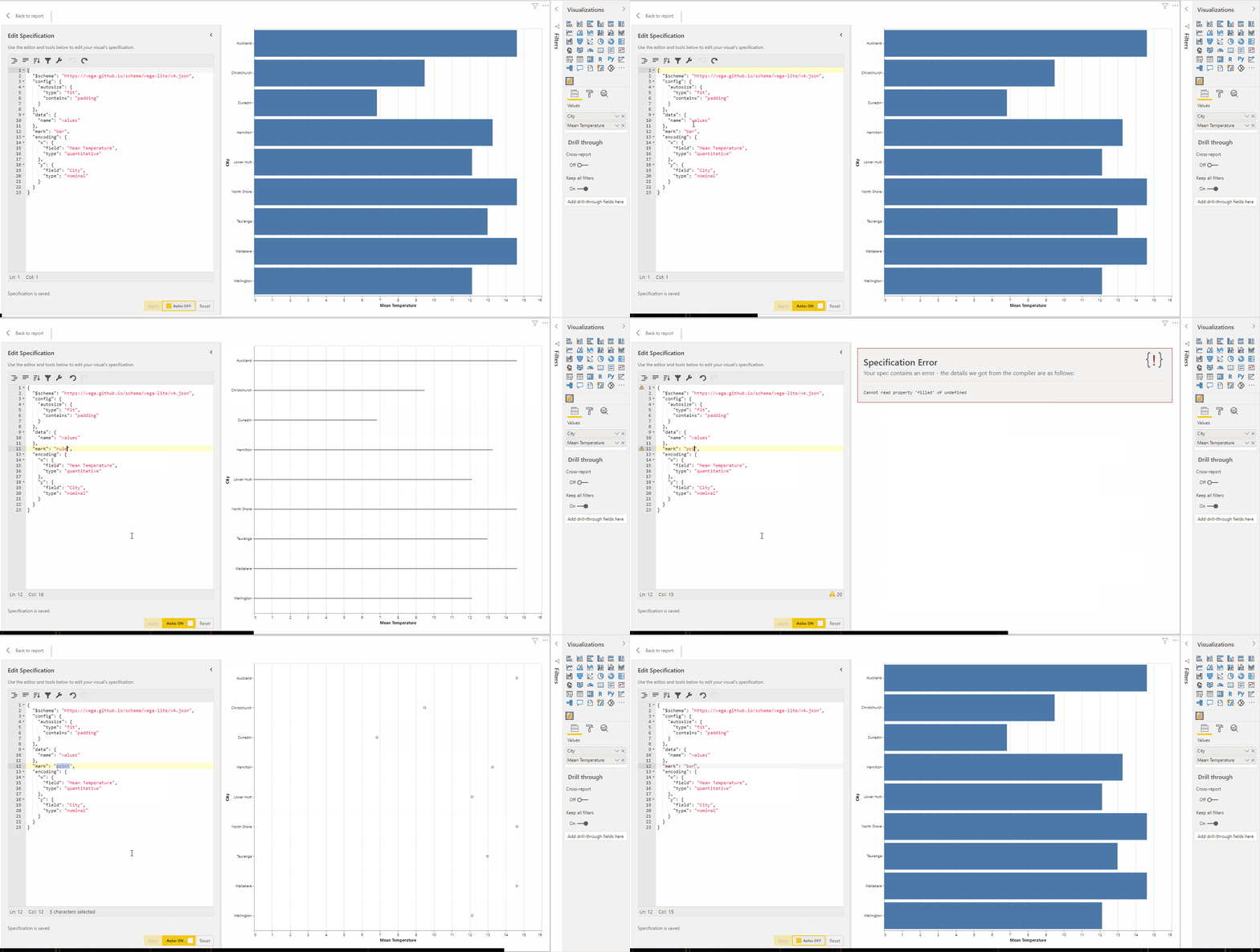
This works nicely with smaller volumes of data, but also depends on how you’re choosing to visualise it. If you’re producing a lot of visual elements (marks, layers etc.) then re-rendering every single time the specification updates can get a bit much, so this is disabled by default. Once I get into perf tuning, we might introduce some options to improve the experience for the creator and end-users as much as possible (given how open-ended the possibilities are in here).
Column/Measure Names Exposed to Completers
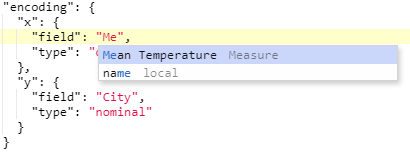
As the specification is text-based, it can be onerous to look-up or type the names for measures or columns in manually. For any that are added to the visual, they will be offered (along with a qualifier as to their type) in the editor’s auto-completion, e.g.:
Data Limits (and Override)
Visuals will re-query the data model every time a user changes a property, or it detects a change in data (slicer/cross filter) etc.
Power BI visuals can get a maximum of 30,000 rows when using a standard data view mapping. If you want more than this, a visual can ask for more one “window” at a time using the Fetch More Data API, which requires more development effort but will let you get as many rows as Power BI is willing to give you beyond the conventional limit. This depends on all kinds of stuff, like memory demands of the visual.
While this is pretty cool, it gets in the way a bit if you’re building a report using a visual that wants all the data for every such change. Therefore for performance reasons, I’m currently capping a visual’s initial dataset at 10,000 rows, unless the creator wishes otherwise (more on that in a sec.).
For example, here’s a simple scatter plot of my Date table, which has a total of 56,248 rows. In this visual, every row is represented with a point. Day of Year (1-366) is on the y-axis, Date is along the x-axis and points and coloured by Month:
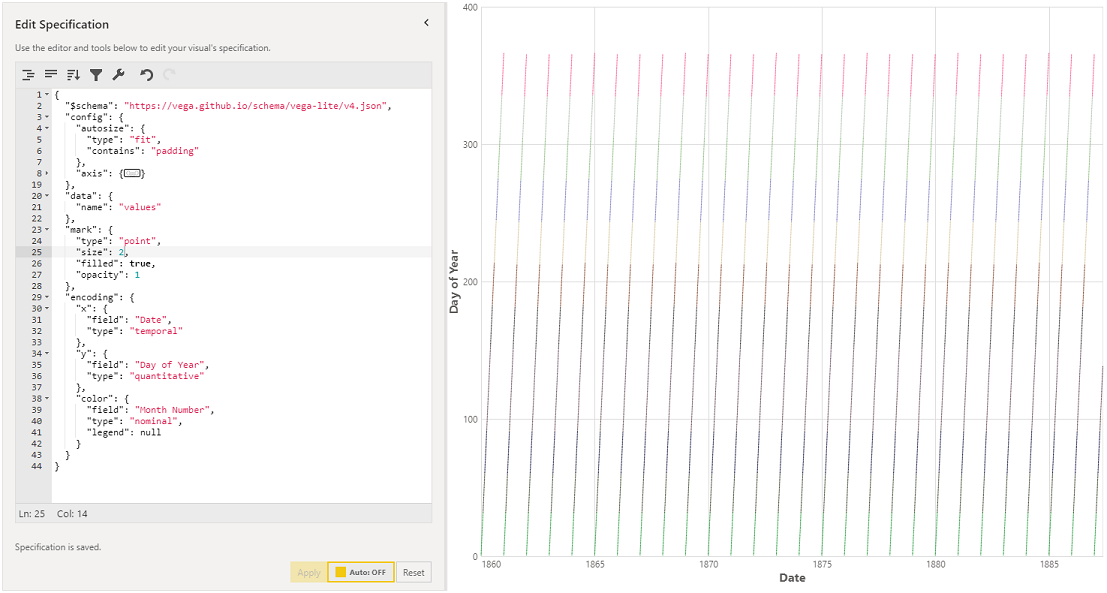
My Date table runs from 1860 to 2014, so this hits the 10,000 row cap somewhere in 1893. The fidelity of the above screenshot doesn’t show it well, but there are 10,000 distinct points.
When you’re ready to let things out with your dataset, the visual has an Override Row Limit property that you can enable, e.g.:
![[Fetch More Data] can be manually enabled as needed. 60_fetch_more](/assets/images/deneb/proto/60_fetch_more.gif)
In this example, all 56,248 rows from the Date table are loaded into the visual and plotted.
Given the open-ended nature of this tooling, creators will potentially need to use this with caution for any designs, but it should provide some interesting opportunities for high-density visual designs.
Standard Tooltips
Vega has the ability to provide a tooltip handler function to a specification. Because Power BI standard tooltips can contain whatever key/value pairs we want to pass to them, the visual has its own handler that will ask Power BI to display them, if the creator adds tooltip configuration to their specification, e.g.:
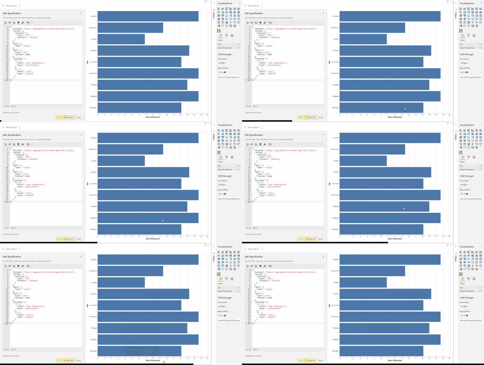
In the above example, we added "tooltip": true to the "mark", which will just provide the current data point’s values to our handler. This can request Power BI to display a standard tooltip.
While the tooltip “works”, it’s worth noting that the visual itself doesn’t provide any feedback on the hover event, and that’s something that the creator would need to implement themselves in the specification. We can add some simple hover effects using features such as Selection, e.g.:

And if we really want to put some work into our design, we can get a little more flashy:
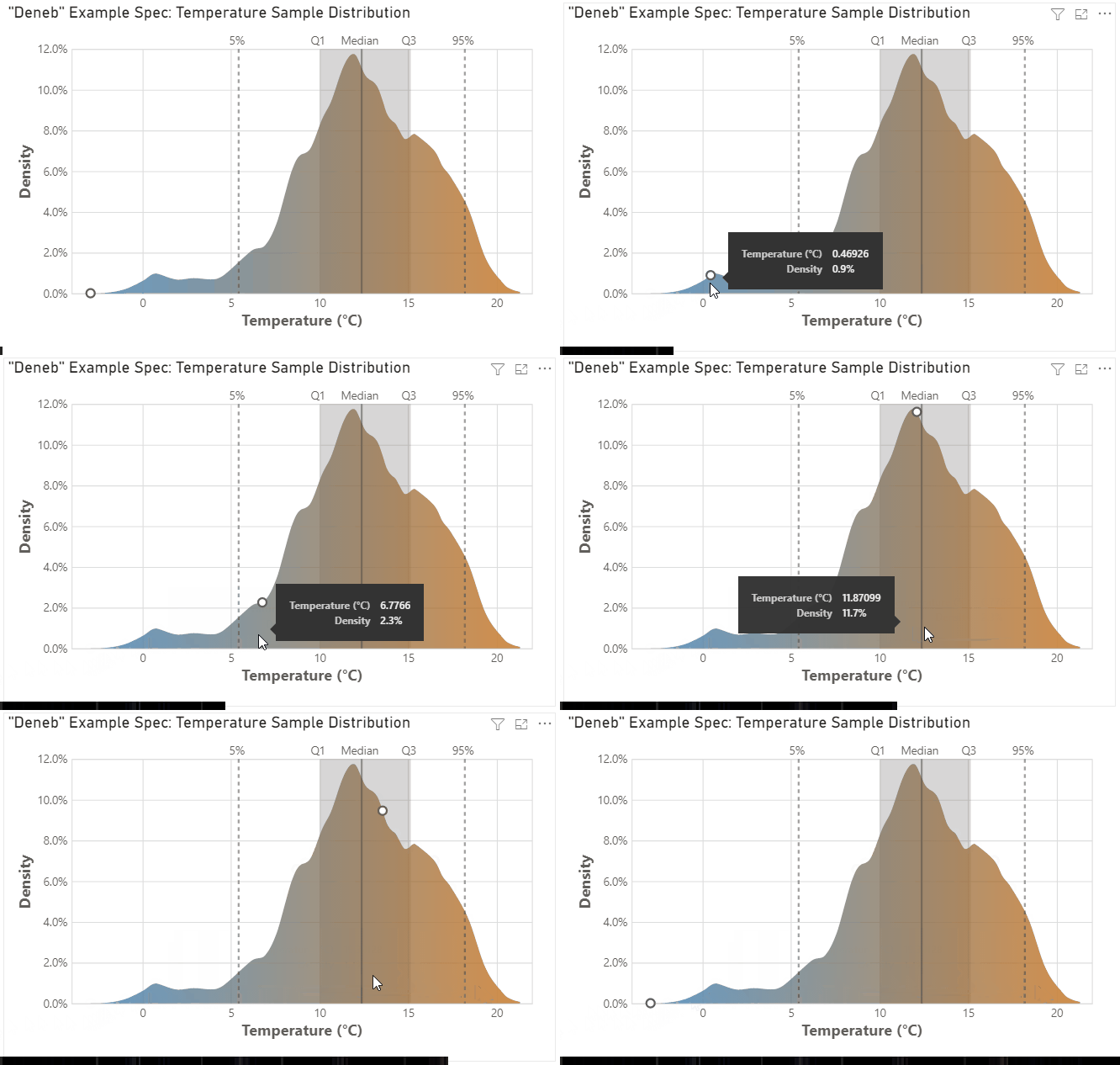
To re-state some words of warning from the previous blog post, while we might be able to have slightly more scope for dynamic content than the R or Python visuals, we may well have some hard lines we might not be able to cross:
To manage your expectations: because this tooling is so open-ended it is highly likely that we will not be able to interact back with other visuals. Cross-filtering, highlighting, drillthrough, report page tooltips etc. have to be implemented with a very fixed idea of what the data structure inside a visual looks like, so that Power BI can perform the necessary lookups between its data points and those of other visuals in a report. As such, the cost of flexible design and implementation currently has some limitations, but I will see if I can do anything about this further down the track; certainly not for a v1 of the visual though.
That’s it for now! I’m putting a lot of my time into the development of this visual, and if the idea continues to remain viable, I’m hoping that my original estimate of end January should be possible to achieve for anyone who wishes to beta test it 🤞
Stay well and safe,
DM-P