
State of (My) Visuals - Dec 2020
I've been saving this one up for a while, and I apologise for the lack of blogging activity over the last few months. I have definitely been busy, and thought I'd better aggregate some of the postings I've been making elsewhere, and provide some updates as to what's been going on in my world of visuals & what's coming up from me.
Contents
Small Multiple Line Chart - Impending Retirement, but Hopefully One Last Big Score
(and a bit of a love-letter to small multiples)
As I release this post, Power BI has at long last got small multiples. They’re in preview, but there’s a strong-looking roadmap ahead and I’m really excited to see that they’re now a first-class citizen of Power BI 🙂
The Small Multiple Line Chart was my first ever attempt at a custom visual, and borne somewhat out of frustration: in 2015, Power BI for Office 365 had evolved into what we know as today’s Power BI. Small multiples, one of (the OG visualisation component) Power View’s most, er… powerful features, never ever seemed to emerge.
I waited and waited for the feature to appear in modern Power BI, as I wanted to use them everywhere I could. Finally, in 2018, I decided to start figuring out how to develop custom visuals so I could do it myself. It took three months of any free time I had and a lot of swearing, and v1 of the visual made it into AppSource. And started me on a path I never expected to go down, but have thoroughly enjoyed being on ever since. I have learned heaps about the visualisation layer in Power BI that I don’t think I ever would have got appreciation of otherwise; I can certainly appreciate that building small multiples into Power BI as a core feature has been a huge undertaking, and one the team should be incredibly proud of.
I love that Power BI allows us as developers to produce and distribute our own visuals, and lets other people use them too. I have had some amazing feedback on my work, as well as some great advice. The version of the SMLC that exists in AppSource today is the product of a lot of that feedback, as well as my continued learning, and I’m incredibly grateful for the input and enthusiasm of other users who have inspired me to keep working.
As I develop visuals in my free time, and release them free of charge, I can only support so many. And given that small multiples are now well on their way to being a core feature, I have decided that it’s time to focus on different gaps in Power BI’s visualisation capabilities for users that are happy to roll up their sleeves a bit (more on that later).
I plan to roll-up a couple of updates into version 2.3 of the visual, but these depend on some changes that will be coming to the visuals SDK in the new year. Once I have confirmed these will serve the visual as I’d like, version 2.3 will be the final feature release.
As there are reports out there that may still use the visual - and this would be awesome if people do - I’ll be keeping the visual in AppSource and will do my best to fix any bugs that might come up (although, touch wood, all know bugs are currently squished).
HTML Content - “v1 Announcement” and v2 Progress
The process of deciding on and developing HTML Content happened so quickly, I forewent a proper blog post and just went straight to Twitter:
As the #powerbi HTML Viewer recently disappeared, I've built a replacement that provides same functionality + a few enhancements (incl. measure support). For the ambitious maker, it has the same limitations as HTML Viewer due to custom viz permissions (1/3)
— Daniel Marsh-Patrick (@the_d_mp) June 25, 2020
But for anyone who wants to know more about how it works, or see it in action, the PowerBI.tips folks were kind enough to invite me to do a webinar:
At the end of the webinar, we have a short look at “v2” of the visual, which provides the option to move editing into the visual rather than the data model. You’ll still be able to use it in the way you do currently if you prefer, but if you want to get even more expressive, there will be some rather unique features that this new functionality will offer (amongst other things):
- Editors for the HTML component and the visual stylesheet, allowing more control over the “document”.
- Support for handlebars template syntax, to control the position of measures and columns added to the visual.
- Some helper functions to boost the standard ones offered by handlebars.
I’m also putting a lot of effort into documentation and the visual will have its own dedicated website, with much more detail than exists currently.
Mike at PowerBI.tips has been alpha-testing the visual and provided me with some really valuable feedback. In re-working some of the editor UI, I had another idea, which caused me to disappear down a rabbit-hole of rapid prototyping and might cause a small delay to v2 of this visual, but I’m hoping what this distraction could potentially be able to offer might make up for that…
“Deneb” - Visualisation Grammar Prototype
Power BI has support for the R and Python languages through their core visual set. However, these, rely on a local (or hosted) interpreter, have a “cold start” time to execute the code and render the result as an image.
Another option we’re fortunate for these days is Charticulator, which I’ve previously blogged about. It’s an amazing tool that provides users with a GUI that they can use to design a bespoke visual and then export it as a packaged Power BI custom visual.
There’s tons of other ways to create charts on the web, and one I’m hugely interested in is Vega, and it’s higher-level companion: Vega-Lite. Both of these frameworks allow folks to compose a specification using JSON-based “visualisation grammar”, which in turn directs the Vega compiler to generate visuals.
As the Vega tooling is web-embeddable, it’s possible to use it to develop and create a Power BI custom visual, and Microsoft has an example repository for that. For someone who wants to build a dedicated custom visual, this is an awesome kick-start and has huge benefits, but for someone who wants to build a specification inside Power BI, it’s still quite an overhead.
As the Vega tooling uses JSON data, this should be straightforward to manipulate in a text editor. Enter a new idea I’m trying out, currently codenamed “Deneb”:

The goal with this visual is that we can add columns and measures to it, just like we can for a Table, R or Python visual. This will produce an “empty” chart, e.g.:

If we put the visual into focus mode, we now have an editor, with a very simple, empty specification, e.g.:

The resuling data we’ve added to the visual is declared as a data object, with a name of "values", and this is now referencable by the specification, so we can simply edit the placeholders and replace them with our measure and column, e,g.:

If we click the Apply button, our chart now updates:

Finally, we can go back to the report and our visual returns to its original size, e.g.:

The above is a very simple example, but we can start to build more complex ideas up, using the “visualisation grammar” concept that the Vega tooling exposes, e.g.:

This above example takes a simple unique sampling value column and measure (like this concept) and uses a transform in the specification to produce a density curve of temperate readings. We’ve also applied gradient colours and some additional marks to show the quartiles and median. If you want to try this yourself in the Vega-Lite tooling separately, the JSON can be found here.
I have a little way to go with this one, but I’m hoping to have it available for beta testing by end of January if everything works out.
To manage your expectations: because this tooling is so open-ended it is highly likely that we will not be able to interact back with other visuals. Cross-filtering, highlighting, drillthrough, report page tooltips etc. have to be implemented with a very fixed idea of what the data structure inside a visual looks like, so that Power BI can perform the necessary lookups between its data points and those of other visuals in a report. As such, the cost of flexible design and implementation currently has some limitations, but I will see if I can do anything about this further down the track; certainly not for a v1 of the visual though.
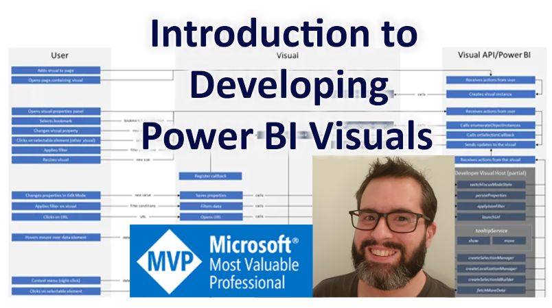
RADACAD Course - Introduction to Developing Power BI Visuals
And one last thing: Power BI visuals development is highly rewarding, but the learning curve is steeeeeeeeep, and there’s not a lot of dedicated resources out there. I’m fortunate that the RADACAD team supported my proposal to build a course for new custom visual developers (and maybe existing ones, too!) and my Introduction to Developing Power BI Visuals course has just been published in their academy:
If you’re interested in learning how, dive a bit deeper into the framework or explore a less-beaten path of Power BI, I think you’ll get a lot out of it.
I also cannot praise Reza and Elizabeth at RADACAD enough for their encouragement, support and guidance (and patience!) throughout the production of the course - they are the most amazing people… although I don’t know anyone that has an opinion to the contrary 🙂
Stay well and safe,
DM-P