
Power BI, the Violin Plot and Data Grain (Sampling)
The purpose of the Violin Plot custom visual for Power BI, is to visualise the distribution of your data.
One of the trickiest concepts to get used to is how to structure your data properly, to maximise its full potential (and also get the results you expect). The most common question I have seen around is understanding how to get the visual working properly and a lot of this hinges upon correct use of the Sampling field.
It is somewhat different to how the majority of other visuals work in Power BI, because most of them will work on data that groups and aggregates at the highest level possible.
The techniques we’re going to cover in this article will also help you with:
- Other similar custom visuals, such as Jan Pieter Posthuma’s Box and Whisker chart and Box and Whisker chart by MAQ Software ;
- Custom visuals created with Charticulator;
- Working with the ‘raw’ data of your model with R and Python visuals.
You’ll hopefully gain some appreciation of aggregation within Power BI in general, which should come in handy for a number of situations.
What We Need
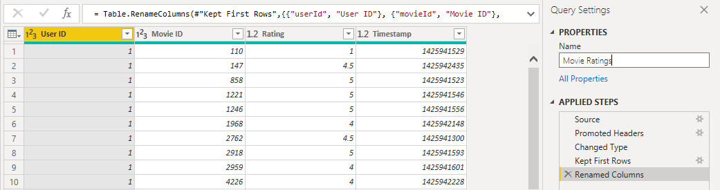
Because the visual will generate statistics and information about your data, it needs it at the lowest level of grain - basically, what makes each row of your data… a row. Let’s take a look at what this means, using a large dataset of movie reviews.
Here’s a representation of what this looks like in Power BI Desktop’s data view:
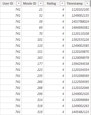
From the above, we can see that:
- Rating is the measured rating, so is a good candidate for our measure of interest
- User ID and Movie ID potentially relate to other tables, and are good candidates for a categorical variable
- Timestamp is the recorded time of the rating by the related user for the related movie
With this in mind, we’re going to explore how Power BI aggregates measures against categories. We’ll work with the Rating and Movie ID fields for this example.
What We Expect
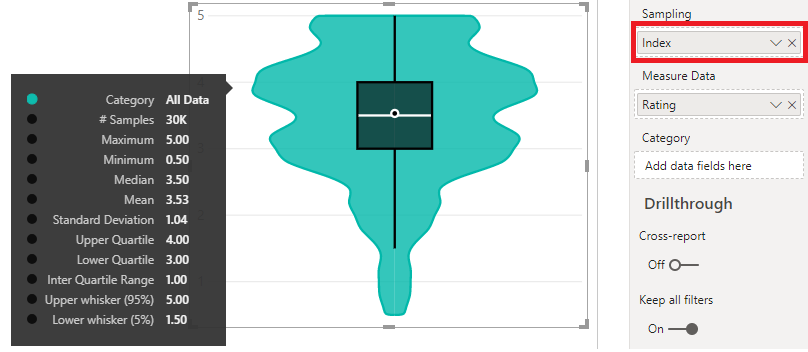
First of all, let’s look at what the distribution should look like visually for our dataset:
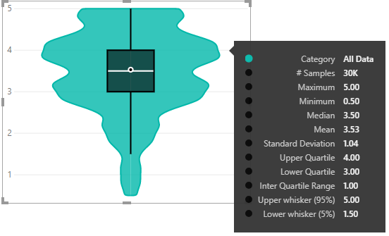
Looks like we have 30K movie reviews in total, and (for these data) are largely positive… or at least above-average :)
Aggregation by Category
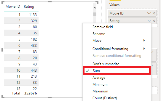
Starting with a table, let’s drag in the Rating and Movie ID fields and see what happens:
(I know I shouldn't be promoting the use of implicit measures for aggregation,
but I'm trying to get to my point as soon as I can...)
So, we can see that by default, Power BI applies a sum aggregation by Movie ID. As a reader, we can’t really infer anything about our data at a lower level from looking at this table. The Violin Plot has the same problem with this level of detail, and we need to dig deeper.
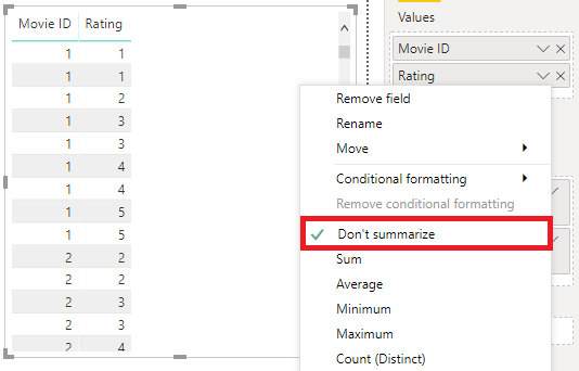
“I’ll Just Set it to ‘Don’t Summarize’. Problem Solved!”
So, we done this and it looks pretty good! It’s just like our raw data!

Let’s test this out. We’ll add Rating again but set its aggregation to Count:
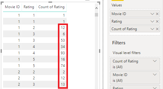
Uh-oh. It starts out well, with the first rows giving a total of 1, but it goes downhill pretty fast after that.
We can see that most of these rows have a count of >1 in them, and there are quite a few more if we scroll down. It’s kind of important to know if multiple values occur more than once when it comes to understanding our distribution.
If our data has a low number of distinct values but a high number of rows for each, like our movie data, then each measure value is going to have a lot more than 2 rows - probably thousands - for each unique combination. This is really not going to give us the truth about our data distribution. Let’s check the visual representation:
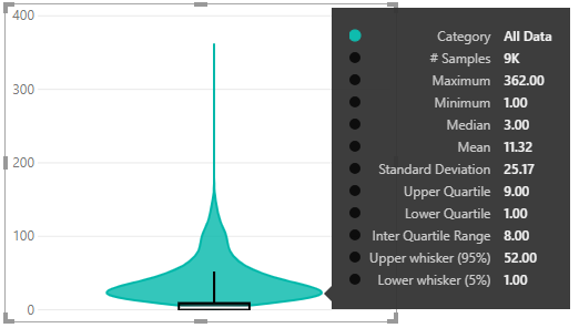
If we compare with the reference example above, the distribution and statistics are completely out of whack. Look at the number of samples - it’s now 9K rather than 30K. This is because we’re looking at the number of Movies (sampling by Movie ID) rather than the number of movie reviews.
What if I try to average the rating for each movie ID?
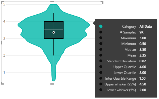
Our distribution looks better, but because the stats are based on the average rating for each Movie ID we’re just lucky that the shape is right. We still don’t have enough detail to completely know our distribution stats because Power BI aggregates the data by Movie ID before the visual sees the data. This means that the individual review ratings cannot be accessed by the visual.
So to summarise, all we really did was give Power BI a second level of aggregation, by our measure (which is now being treated as a group).
So… How Do We Resolve This?
It goes back to the grain of your table. We took a stab at quickly defining this up-above, but let’s borrow from The Kimball Group’s definition - key points are:
- The grain establishes exactly what a single fact table row represents.
- Atomic grain refers to the lowest level at which data is captured by a given business process.
This is exactly what we need to put into the Sampling field of the Violin Plot, or other such datasets if we want to have our visuals showing the level of detail we expect.
If you have it, then a primary key, or some kind of unique identifier column is perfect.
However, sometimes your dataset may not have this, and our example doesn’t either - the only IDs we have are for the Movie or the User, which are not the correct level of grain for our analysis.
Fortunately, Power BI (or specifically Power Query) has our back and we can add an Index Column to provide this functionality in our dataset. Let’s edit the query for our table:
On the ribbon, click Add Column > Index Column > From 1.
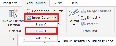
Power Query has now added a column with a unique (incrementing) number:
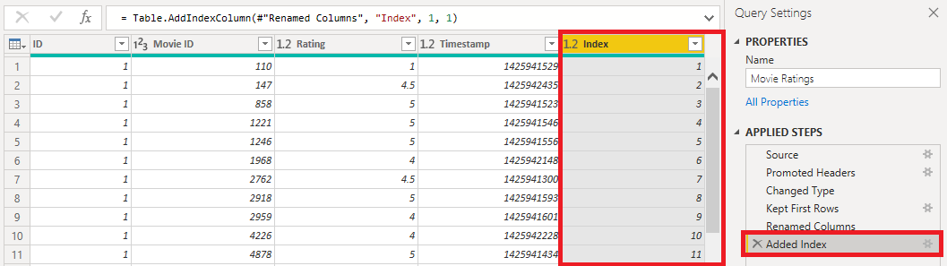
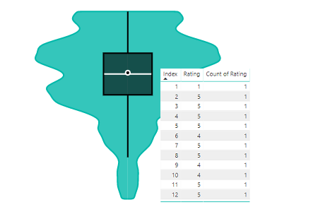
If we Close & Apply our query, we’ll see the Index field in our data model, and we can add this to the Sampling field in the visual, e.g.:
Just to verify, we’ll repeat the ‘count test’ from above:
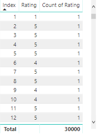
Sweet! Looks like we get a count of 1 for each value of Index :)
Wrapping-Up
This one took a few twists and turns, but I feel that it’s quite a valuable concept to understand. I had these struggles when I started using similar custom visuals, so I’m hoping that the reader’s journey down the unhappy path before getting to where we need to be helps you to absorb more about the concepts we’ve gone over:
- When working with the data model in visuals, Power BI will summarise/aggregate supplied fields and measures.
- A number of custom visuals are distribution-based and these require much more detail to go into the visual than usual. This might also be required if you’re using the R or Python visuals.
- In these cases, we need to identify the lowest-level of grain for our data and ensure that this is passed to our visual, so that it works as intended.
I’m hoping that you enjoyed reading and this post has clarified things for you, if you were previously unsure as to how it all fit together.
Similarly if there’s still bits that don’t make sense, I’d love to hear from you, as it’s a bit of a different concept to the norm; I’m working in this area pretty heavily and may still be able to improve upon how to better introduce to the uninitiated.
Back soon!
DM-P