
What’s Coming in Small Multiple Line Chart 2.0.0
The Small Multiple Line Chart was my first foray into developing custom visuals for Power BI. It represented a huge amount of learning and personal development, so I was really happy to release it to the Marketplace and I've had some pretty awesome feedback from many users around the world.
There were a number of great suggestions for improvement, and quite a few issues that needed attention. When I sat down to review how I can make these changes, I realised I perhaps needed to re-architect the visual to support them. A couple of months back, I bit the bullet, and decided I was going to get them done. This release represents a huge amount of rework and utilises many more features of the custom visuals SDK, and should provide users with much more functionality and stability.
Here's a run-down of the changes to expect in this release.
Contents
Availability
The visual is currently undergoing testing with the custom visuals team, and while the listing has been updated to show version 2.0.0, the visual takes a little longer to come through and for the moment, version 1.0.1 will continue to show in your reports. I’ll update this article when everything is fully live.
If you are using this through the organization custom visuals mechanism, you can download the 2.0.0 version of the visual from the repository’s Releases page in the meantime.
The visual continues to remain open source, for anyone who wishes to contribute or use the code to learn how to write their own custom visuals.
Specific Property Menus
The v1 visual had a single menu for managing aspects of configuring small multiples, but this resulted in some complex management of property states internally. This menu has been split into three separate ones:
- SM Layout - configuration of the small multiple ‘grid’, including behaviour.
- SM Heading - configuration of the small multiple heading (formerly known as Label).
- SM Styling - configuration of the small multiple background and border styling.
Each menu’s functionality is explained in its own section below.
SM Layout Menu
The behaviour of the grid is specified by using Column Sizing and Row Sizing, and their associated properties. You can use specific combinations of these properties to better control how your small multiple ‘grid’ is laid out.
Specifying a Multiple Height or Multiple Width allows you to guarantee the sizing of the particular dimension of your small multiples, if you are unsure as to how many will be displayed in the visual at one time (for example, if your report contains interactions and users may be doing their own filtering).
Column Sizing
Column Sizing has two settings:
- Fixed Width (default) - specify a width for each small multiple, in pixels. The visual will ‘flow’ small multiples onto the next row to ensure that widths are preserved, e.g.:
- Fixed # Columns - specify a number of columns to fit in each row. This will divide the width evenly for each row and is the way the v1 visual would calculate widths for each small multiple, e.g.:
Row Sizing
Row Sizing has 2 settings:
- Fixed Height (default) - specify a height for each small multiple, in pixels. If the visual height is too small to display all small multiples vertically, then the visual will scroll to accomodate them.
- Divide Evenly - divide the row height evenly, over the height of the visual. This is the v1 behaviour of the visual, in conjunction with Fixed # Columns above.
SM Heading Menu
This menu contains all options that used to be responsible for controlling the heading (formerly known as Label). With the exception of some fixing of issues around handling text at higher font sizes, this is largely unchanged and simply represents a logical grouping of the properties.
SM Styling Menu
This property menu is responsible for handling the styling of small multiple backgrounds and borders, and similar to the SM Heading menu, is largely unchanged, with the exception of improving the cosmetic behaviour of small multiple borders to look more consistent (some edges were uneven in v1) and some minor changes to the Zebra Stripe properties - now renamed to Alternate Background Color.
Alternate Background Color
A Color By property has been added, which allows the following options:
- Column - the color is applied to each alternate column within each row. This is how Zebra Stripe was applied in v1.
- Row - the color is applied to every small multiple in each alternate row.
- Small Multiple - the color is applied to each alternate small multiple, across the whole visual. If you have an even number of small multiples in a row, this can look very similar to Column.
Line Styling
In version 1, the only option for lines was to change the colour. The options have been expanded quite significantly for version 2. All properties can be found in the Line Styling property menu, and a new section will be displayed for each measure you add to your visual.
Please note that measures in the Line Styling menu are separated with hyphens (
----------). This is because containers (where measures are selectable via dropdown) are not yet fully supported for non-Microsoft visuals. This is expected to be available “sometime in 2020” and as soon as it’s available, it’s definitely going into this one.
Stroke Width
You can use Stroke Width to tailor each measure’s thickness, e.g.:
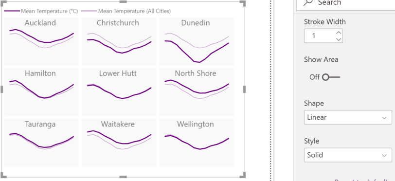
You can set this to 0 to hide the line if you just wish to use Show Area for your measure. Speaking of which…
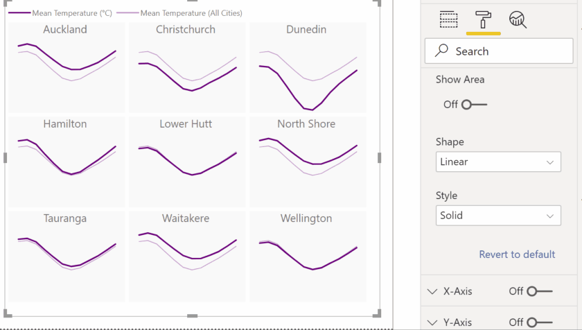
Show Area & Transparency
A measure can be set to behave as an area rather than a line, by setting Show Area to On. Once this is enabled, an additional Transparency property is available, e.g.:
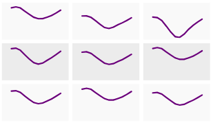
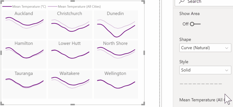
Shape
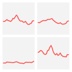
The Shape property allows you to specify how the data points are interpolated, e.g.:
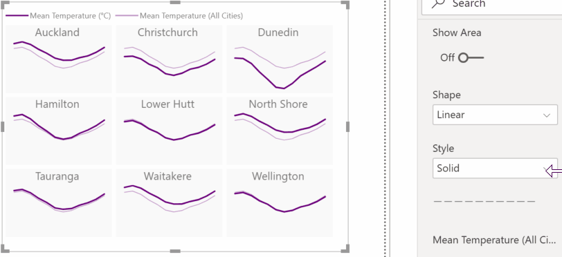
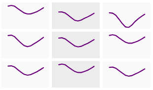
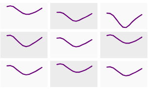
Style
The Style property provides different line styling for each measure, e.g.:
An additional curve type of Cardinal is also available, should your data not work well with the Natural curve type (in most cases, Natural should work fine).
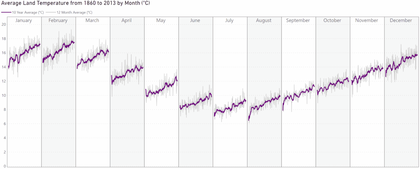
Improved Tooltip Functionality
Since the visual was initially released, support for canvas (report page) tooltips has been made available. This has been added into the visual, e.g.:
The Tooltip menu, which enables the user to configure the standard tooltip more fully, has also been made available in the visual.
Version 1 had some minor issues with tracking data points with the mouse, and this has also been improved.
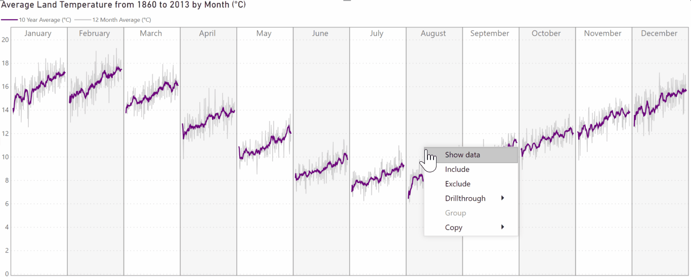
Context Menu, Drillthrough & Drilldown
Context menu support is also a recent addition to the custom visuals SDK, so the visual has been enabled with it. If you’ve set up a suitable drillthrough page that will contain eligible fields or measures then drillthrough becomes available, e.g.:
The Small Mutliple field has been enabled for drilldown, if using suitable attributes or a hierarchy, meaning that this is also possible via the context menu, e.g.:
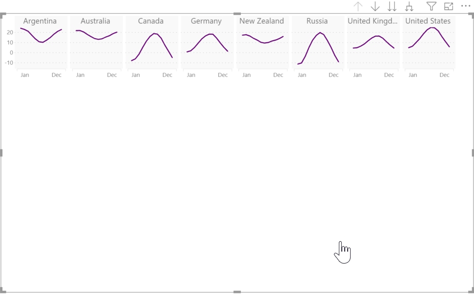
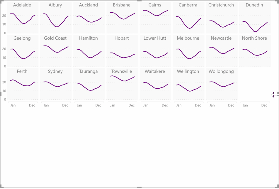
Categorical X-Axis Support
Probably the most requested (and most overlooked) feature from the original release, is the ability to include a categorical field on the X-axis. The x-axis now supports linear, categorical and date/time fields:
Please note that with categorical fields, it’s assumed that these are intended to be used in an ordinal (ordered) manner. Line charts aren’t a good visualisation choice for nominal categories.
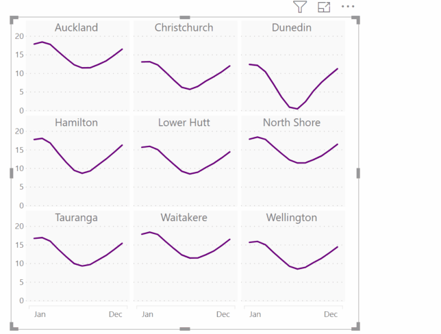
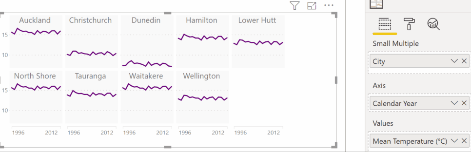
Sorting
Standard sorting is now available from the ellipsis (...) in the visual header, and you are now able to sort using any field that ois present in the visual’s data roles, e.g.:
Increased Data Limits
As part of the re-write, I’ve been able to improve the performance of the visual, so the data limits have been upped from 50 small multiple values and 200 axis values (10K total) to 100 small multiple values and 300 axis values (30K total).
What’s Next?
Now that the visual has been re-written, the code-base is much more accomodating for additional features, so I’m hoping to keep the momentum up after a long hiatus on this one.
I’ll initially be focusing my efforts on finally getting the visual certified but would love to hear from anyone who has ideas for improving it further. Please feel free to log any requests or potential issues in the visual’s GitHub repository.
Thanks very much to everyone for their continued feedback and great ideas, and I hope that you find the new changes valuable additions for visualising your data stories!
Until next time,
DM-P