
Lifting and Shifting a Simple d3.js Line Chart into A Power BI Custom Visual (Part 2)
Hi there! It’s time to pick up where we left off in part 1. if you’ve not read that one, it’s probably worth going back and getting up to speed.
For those who are ready to continue, we’re going to cover off the remainder of the work to migrate our reference line chart that we found online.
Code for Our Example
The GitHub repository has been updated with the additional code to complete the migration of our reference visual into a Power BI custom visual, available in the part-2 tag (or this pull request). If you want to start with the code as at the end of part 1, you can run the following in the root of your project:
1
git checkout part-1
Let’s get on with the show!
Adding the Chart Container
In our reference visual, a containing element for the chart is added to the page. This is handled by the following code in the HTML section:
1
2
<!-- Create a div where the graph will take place -->
<div id="my_dataviz"></div>
In our visual, we’ll handle this in the constructor so that the element is created when instantiated.
First, we’ll ensure that d3 is imported into our visual code. Add the following to the bottom of the import statements in visual.ts:
1
import * as d3 from 'd3';
Note that with the newer SDK it’s possible to import
d3modules individually. We’re trying to ensure that our code runs with minimal intervention so we’re pulling in the whole library for now. Tweaking the code to used3-selectionmight be a fun little exercise for you :)
Next, we’ll add a class property underneath settings:
1
private container: d3.Selection<HTMLDivElement, any, HTMLDivElement, any>;
This essentially specifies that our element is an HTML div with a parent of div also.
In the constructor function, we’ll now use d3 to add the element to the main container. The function should now look as follows:
1
2
3
4
5
6
7
constructor(options: VisualConstructorOptions) {
    console.log('Visual constructor', options);
    this.target = options.element;
    this.container = d3.select(this.target)
        .append('div')
            .attr('id', 'my_dataviz');
}
If we refresh the visual and we inspect it using our browser’s development tools, then we now see the following element in there:
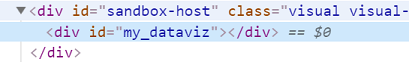
div element in our visual's DOM with the same id as our reference chartNow we have somewhere to attach our chart, we’ll move onto the drawing of the chart.
Dimensions and Margins
The reference code starts with the following code:
1
2
3
4
// set the dimensions and margins of the graph
var margin = {top: 10, right: 30, bottom: 30, left: 60},
    width = 460 - margin.left - margin.right,
    height = 400 - margin.top - margin.bottom;
This defines margins and then sets the usable width and height of the chart based on a container size of 460 x 460 pixels. Because our container might be of variable size, we can use the options.viewport object in our visual’s update method to dynamically size our container.
We’ll add the equivalent code at the bottom of our update method. This is a little different to our reference visual - this is a preference of mine, to ensure that we successfully have data before we do anything else in terms of drawing the visual.
Copy/paste or add the below code into your function, underneath the console.log(data) statement:
1
2
3
    var margin = {top: 10, right: 30, bottom: 30, left: 60},
        width = options.viewport.width - margin.left - margin.right,
        height = options.viewport.height - margin.top - margin.bottom;
Adding the SVG
Moving through our reference chart, we’re now at this bit of the code:
1
2
3
4
5
6
7
8
// append the svg object to the body of the page
var svg = d3.select("#my_dataviz")
  .append("svg")
    .attr("width", width + margin.left + margin.right)
    .attr("height", height + margin.top + margin.bottom)
  .append("g")
    .attr("transform",
          "translate(" + margin.left + "," + margin.top + ")");
This is almost possible to copy as typed, but we just need to make sure that we append to the element we created in the constructor. Here’s our version - add this underneath the previously-added section of code:
1
2
3
4
5
6
7
8
/** Append the svg object to the body of the page */
    var svg = this.container
        .append("svg")
            .attr("width", width + margin.left + margin.right)
            .attr("height", height + margin.top + margin.bottom)
        .append("g")
            .attr("transform",
                "translate(" + margin.left + "," + margin.top + ")");
As you can see, all we’ve changed is the binding to this.container rather than selecting the element by id. (my tab indentation is a little different to the above for personal preference).
If we refresh our visual, we see that there is now a SVG element (with a g element as a child) in the custom visual DOM, with the dimensions of our viewport (less our margins), e.g.:
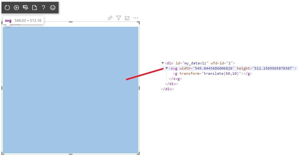
svg and g elements in our visual's DOMSo far, so good. This will also ensure that our svg ‘canvas’ will stick with the visual as we resize it. Let’s give that a try and have another look:
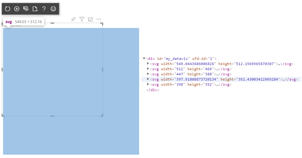
Yikes! That’s the wrong size! And there’s loads of svg elements! Why!? Let’s break down what Power BI is doing with the visual:
- The visual is added and the
constructorevent runs. This adds thedivelement to the canvas (this.containerin our code). - When any change happens in the report page - that can be a resize, data change, cross filter or other interaction, the
updateevent in our visual is fired. - The
updatemethod adds a childsvgelement to thedivwe added in ourconstructor.
With our reference chart, we don’t need to think about dynamic sizing or other things our user might be doing. It’s pretty static.
We need to add some kind of management in our update function to manage this. The simplest way is to clear the canvas before we draw our other elements. Add the following to the top of the update function, underneath the this.settings assignment:
1
this.container.selectAll('*').remove();
This will simply clear all elements that are in the container each time update runs.
Note that this is an acceptable approach for simple visuals, but if your custom visual potentially contains a lot of complex SVG logic to plot things, then you may want to be more selective in doing this. For now, we’re just focusing on the task at hand :)
The Rest of the Chart
We’re now left with the actual code that draws the axes and line. Here’s what’s left from our reference chart example:
1
2
3
4
5
6
7
8
9
10
11
12
13
14
15
16
17
18
19
20
21
22
23
24
25
    // Add X axis --> it is a date format
    var x = d3.scaleTime()
      .domain(d3.extent(data, function(d) { return d.date; }))
      .range([ 0, width ]);
    svg.append("g")
      .attr("transform", "translate(0," + height + ")")
      .call(d3.axisBottom(x));

    // Add Y axis
    var y = d3.scaleLinear()
      .domain([0, d3.max(data, function(d) { return +d.value; })])
      .range([ height, 0 ]);
    svg.append("g")
      .call(d3.axisLeft(y));

    // Add the line
    svg.append("path")
      .datum(data)
      .attr("fill", "none")
      .attr("stroke", "steelblue")
      .attr("stroke-width", 1.5)
      .attr("d", d3.line()
        .x(function(d) { return x(d.date) })
        .y(function(d) { return y(d.value) })
        )
We can copy/paste this to the bottom of our update function as-is. We just have one teeny-tiny problem to worry about:
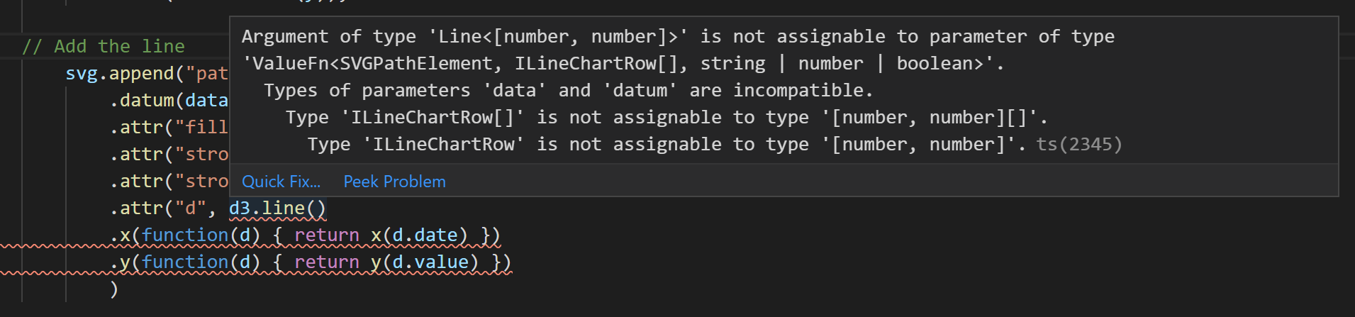
line functionTo break this down here, TypeScript expects a certain data type in the line function. This is assumed to be an array of number pairs (x/y values). In the datum function call higher-up, we pass in the data variable we declared earlier. This is of type ILineChartRow, which is the interface we defined in part 1:
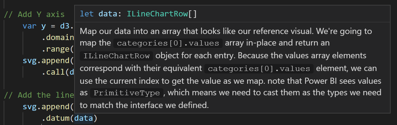
datum function with data variable definitionThis interface tells TypeScript what the expected ‘shape’ of the datum for each x/y pair is a Date/number rather than the default. We need to ensure that the d3.line function expects this also, so modify this part of the code as follows:
1
d3.line<ILineChartRow>()
If you’re not sure, refer to the corresponding Git commit for the solution. I have added a comment at the appropriate location.
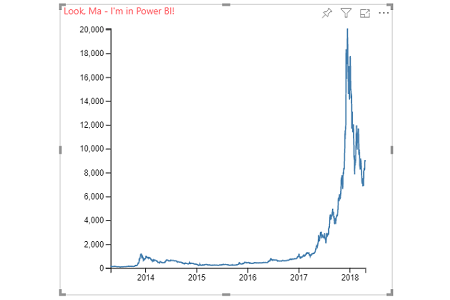
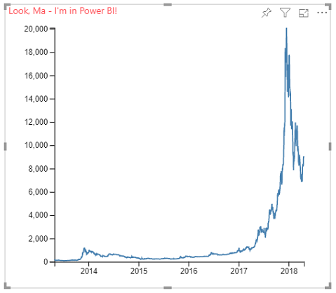
Save and our visual should compile as normal. If we refresh, we should see our chart:
Wrapping-Up
So, we’ve finally got there! Today, we’ve covered the following:
- Created the main container for our chart in the visual
constructor. - Ensuring that
d3is loaded in our visual. - Moving the dimension/sizing code across and ensuring it fits our visual viewport.
- Moving the SVG canvas code across and tailoring it to fit our container element.
- Making sure that our
updatefunction clears down any previously drawn elements when things change. - Moving the code that plots the axes and the line, and making it TypeScript-compliant.
- Patting ourselves on the back for a job well done!
This was a straightforward example but hopefully gives you some insights into the custom visuals framework and how you might be able to migrate something cool you’ve seen or previously developed in d3 for use in Power BI.
Now we have our line chart, we can start using it to explore other features that Power BI can offer. If anyone has any suggestions for what they might like to see next as an expansion of this project then please tweet me, or add a comment below and we’ll see what we can do to unpack things a bit.
Thanks very much for reading and I hope that you’ve found the exercise useful. See you soon!
DM-P