
Lifting and Shifting a Simple d3.js Line Chart into A Power BI Custom Visual (Part 1)
One of the more common scenarios for people wanting to learn the custom visuals SDK is how to build chart types other than a bar chart (which is pretty well covered by the Sample Bar Chart Repo by MS).
There are a number of ways to plot visuals in TypeScript, particularly as the latest version of the SDK supports ES6 modules and I’m hoping to tackle some of these at a later date.
Because of the recent SDK changes, there’s a drought of examples for this new version, and I’m hoping to enable people to continue learning by posting about it whenever I can.
Because it’s so widely used for visualisation on the web, today we’ll focus on d3.js. It’s pretty easy to just search the web for “d3 [x] chart” and get a lot of examples that will work pretty nicely in a web page, but it can be tricky to understand how you can take such an example and make it work inside a Power BI custom visual.
The truth is, it’s not that tricky to get started once you understand how you need to have your data roles, data view mappings and view model set up in order to fit the same format as the example you’re referring to. Once you have this figured out, it’s quite good fun to figure out more optimal ways to learn how to optimise this, as the data view mapping to replicate the code you’re referring to might actually be more complex than it needs to be… but that’s not our objective here.
Before we Begin
While the exercise is straightforward, we’re covering a lot of theory about the Custom Visual SDK’s dataView and other areas before we even begin. As such, this is split into two parts:
- Covers mapping the
dataViewinto a shape that fits our existing reference chart. - Migrating the plotting logic into the custom visual framework.
As per this recent post on the table data view mapping, we’re assuming that you have at least set up a development environment. We’re going to be working with the latest version of the SDK - at the time of writing this is 3.1.2, which can be forced by running this from the command prompt:
1
npm i powerbi-visuals-tools@3.1.2 -g
Please bear in mind that if you’re changing the version number from your currently installed one then you’ll also need to run pbiviz --install-cert to generate a new certificate for debugging purposes.
Finished Recipe
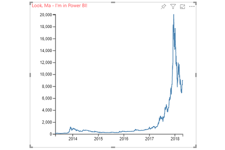
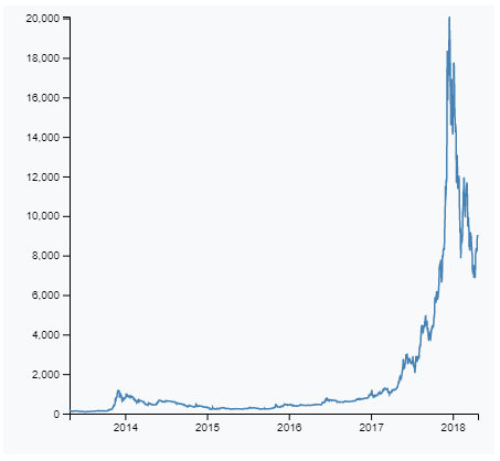
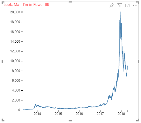
I’ve searched and found this great example of a simple d3 line chart. We’ll port this one into our custom visual.
This reference chart also uses this corresponding dataset. I have added this dataset into a Power BI report and dataset to allow us to do a side-by-side comparison of the original and Power BI version.
Update: this is the direct link to the raw CSV data, if you wish to load directly using Power Query. Use this rather than the link above, or you can click on the Raw button in the page to get the URL for yourself - thanks to Mike Allen for pointing this out :)
This dataset contains two fields:
- Date (category)
- Value (measure)
As such, we’ll introduce code to validate the data types as part of our view model mapping later on.
The source code for the complete example we’re producing will be available on GitHub. You’re welcome to clone this to skip ahead to the end. Note that you’ll need to ensure that all dependencices are loaded and up to date, and you can do this by running the following from the root folder of your project once checked out:
1
npm i
Because the code will grow over time, to view the source as of the end of this article, you can use the part-1 tag, or this commit. The rest of the solution will be available when part 2 goes up (soon)!
Getting Set Up
Create a new visual project. in our example, we’re using d3LineChartExample, e.g.:
1
pbiviz new d3LineChartExample
We’ll check that our visual instantiates correctly and our certificates etc. are okay by running pbiviz start and adding a developer visual to our report in the Power BI Service, e.g.:
Configuring the dataRoles
As noted above, we have a single category and measure in our dataset. We’re not going to handle multiple measures or series in this post, so the existing dataRoles in capabilities.json are fine for this. Here’s what they should look like for our new visual:
1
2
3
4
5
6
7
8
9
10
11
12
"dataRoles": [
    {
        "displayName": "Category Data",
        "name": "category",
        "kind": "Grouping"
    },
    {
        "displayName": "Measure Data",
        "name": "measure",
        "kind": "Measure"
    }
],
Configuring the dataViewMapping
Similarly, the dataViewMapping we’ve got by default should suffice, as this will group the measure by the category. Let’s have a look at the default one that’s in there:
1
2
3
4
5
6
7
8
9
10
11
12
13
14
15
16
17
18
19
20
21
22
23
"dataViewMappings": [
    {
        "categorical": {
            "categories": {
                "for": {
                    "in": "category"
                },
                "dataReductionAlgorithm": {
                    "top": {}
                }
            },
            "values": {
                "select": [
                    {
                        "bind": {
                            "to": "measure"
                        }
                    }
                ]
            }
        }
    }
]
This is essentially saying the category field is our grouping, and then we will bind the measure field to this. In our example we want a single date and value combination, so we’ll make a couple of changes so that the dataViewMapping looks like this:
1
2
3
4
5
6
7
8
9
10
11
12
13
14
15
16
17
18
19
20
21
22
23
24
25
26
27
28
29
30
31
32
33
34
35
"dataViewMappings": [
    {
        "conditions": [
            {
                "category": {
                    "max": 1
                },
                "measure": {
                    "max": 1
                }
            }
        ],
        "categorical": {
            "categories": {
                "for": {
                    "in": "category"
                },
                "dataReductionAlgorithm": {
                    "top": {
                        "count": 2000
                    }
                }
            },
            "values": {
                "select": [
                    {
                        "bind": {
                            "to": "measure"
                        }
                    }
                ]
            }
        }
    }
]
Here’s a run-down of what we’ve done:
- On line 3, we’ve added a
conditionsarray, to limit the number of fields we can put intocategoryandmeasureto 1.- This helps us to constrain the number of fields and focus on getting our visual behaving how we want.
- On line 19, we’ve modified the
dataReductionAlgorithmto have a value of 2000.- This is because without this a custom visual will limit the number of rows to 1,000 by default (our dataset has 1,822).
- You can increase this up to a maximum of 30,000 for TypeScript.
- You can go beyond this limit, but you need to write additional code to manage this. This is beyond the scope of this post.
Back in the Service, we’ll re-load our visual, and add the Date and Value fields to the Category and Measure data roles respectively:
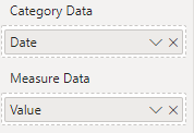
Note that our data roles have ‘closed-up’ to only allow a single field to be added to them.
Inspecting the dataView
Locating the Data
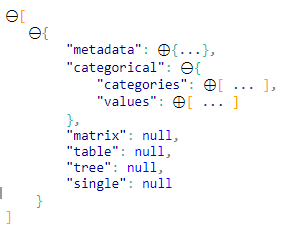
With the above work done, we can click on the Show Dataview icon on the Developer Visual toolbar:

As we’re using the categorical dataView, we can expand the top-level and then the categorical node:
categorical dataViewRelating Categories to Values
You’ll notice that categories and values are arrays. If we expand them both, we’ll see the following:
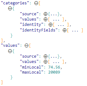
What’s visible here are the fields as we defined in dataViewMapping in capabilities.json higher up. This is defined in the API as a DataViewCategoricalColumn if you wish to know more about its structure. For the moment, we’re just going to look at the values array for each:
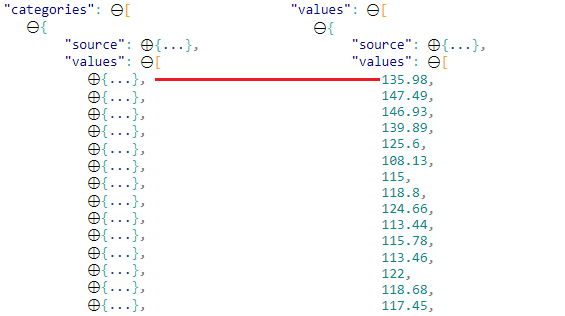
categories and valuesEach element in the categories[0].values array will correspond to the same element in the values[0].values array.
Note that dates are more complex than a plain text string, so each array element with a date will contain an object rather than a string or a number if your category is a more straightforward value. As such, we need to handle the fact that our users might be using something other than what we test with, but for now, we’re just going to assume our data will be a date and generate a linear categorical axis. We’ll handle the processing of this later - for now we’re just looking to show the 1:1 mapping between arrays for our dataViewMapping.
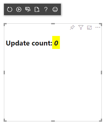
Cleaning up the Visual Code
Because the boilerplate code gives us a simple text node and a counter, we’ll clean up our code and give ouselves a fresh base to work from. Update visual.ts to look as follows:
1
2
3
4
5
6
7
8
9
10
11
12
13
14
15
16
17
18
19
20
21
22
23
24
25
26
27
28
29
30
31
32
33
34
35
36
37
38
39
40
41
"use strict";

import "core-js/stable";
import "./../style/visual.less";
import powerbi from "powerbi-visuals-api";
import VisualConstructorOptions = powerbi.extensibility.visual.VisualConstructorOptions;
import VisualUpdateOptions = powerbi.extensibility.visual.VisualUpdateOptions;
import IVisual = powerbi.extensibility.visual.IVisual;
import EnumerateVisualObjectInstancesOptions = powerbi.EnumerateVisualObjectInstancesOptions;
import VisualObjectInstance = powerbi.VisualObjectInstance;
import DataView = powerbi.DataView;
import VisualObjectInstanceEnumerationObject = powerbi.VisualObjectInstanceEnumerationObject;
import { VisualSettings } from "./settings";

export class Visual implements IVisual {
    private target: HTMLElement;
    private settings: VisualSettings;

    constructor(options: VisualConstructorOptions) {
        console.log('Visual constructor', options);
        this.target = options.element;
    }

    public update(options: VisualUpdateOptions) {
        console.log('Visual update', options);
        this.settings = Visual.parseSettings(options && options.dataViews && options.dataViews[0]);
    }

    private static parseSettings(dataView: DataView): VisualSettings {
        return VisualSettings.parse(dataView) as VisualSettings;
    }

    /**
     * This function gets called for each of the objects defined in the capabilities files and allows you to select which of the
     * objects and properties you want to expose to the users in the property pane.
     *
     */
    public enumerateObjectInstances(options: EnumerateVisualObjectInstancesOptions): VisualObjectInstance[] | VisualObjectInstanceEnumerationObject {
        return VisualSettings.enumerateObjectInstances(this.settings || VisualSettings.getDefault(), options);
    }
}
In my repo, I’ve also:
- Cleaned up the
style/visual.lessfile of any styles we don’t need (i.e. all of them). - Removed entries from the
objectskey incapabilities.json, as we have no visual properties in our design currently. - Removed the
dataPointSettingsclass declaration anddataPointobject fromsettings.ts(to correspond with the changes toobjects).
You don’t have to do these, but I find it useful to start with a clean slate. The state of these files can be viewed in the part-1 tag, (or this commit) for the repository.
Mapping the Data from the dataView
So, we can see that Power BI provides us with two different arrays that we need to reconcile. As the original reference chart uses CSV, we could manage this with a table dataViewMapping, but we can make our visual work better for us later on if we want to introduce its complexity, and having these fields distinctly named in our dataRoles will make it easier for our users to understand how to use the visual :)
If we look at our original reference chart, the bit that handles the data load is this:
1
d3.csv("https://raw.githubusercontent.com/holtzy/data_to_viz/master/Example_dataset/3_TwoNumOrdered_comma.csv",
This is clearly loading from an external URL and we need to point it to the data we’re putting into the fields.
Here’s the documentation for the csv function, but in order to lift and shift our reference chart, we need to match this output so that we can inject it into the code we’re going to refer to. The reference chart uses this function to load the CSV into a JSON data structure and then runs additional functions against the loaded data.
Where our path differs is that we already have our data in our dataView, and we just need to map it into an appropriate JSON structure for the code we want to use. We can then process it in a similar way as the reference chart.
Because we’re using TypeScript, add the following interface to the top of visual.ts, underneath the import statements:
1
2
3
4
interface ILineChartRow {
    date: Date,
    value: number
};
This allows us to define the ‘shape’ of the data in each row so that TypeScript can validate it before we run.
From the reference chart we also have this code to deal with, which returns the object array of formatted date and the value for each row:
1
2
3
4
// When reading the csv, I must format variables:
function(d){
  return { date : d3.timeParse("%Y-%m-%d")(d.date), value : d.value }
},
Because our example is quite tailored to the flat file being imported, we need to add some tests to the dataView so that the visual will gracefully exit if the fields we’re adding don’t match our criteria.
Now, let’s modify the update function to remove the stuff we don’t need, and to put in the stuff we do! We’ll add the code that will test and map the dataView and display the output in the browser’s console. Modify the function content as follows (comments are for the reader’s benefit):
1
2
3
4
5
6
7
8
9
10
11
12
13
14
15
16
17
18
19
20
21
22
23
24
25
26
27
28
29
30
31
32
33
34
35
36
37
38
39
40
41
42
43
44
45
46
47
48
public update(options: VisualUpdateOptions) {
    console.log('Visual update', options);
    this.settings = Visual.parseSettings(options && options.dataViews && options.dataViews[0]);

    /** Test 1: Data view has both fields added */
        let dataViews = options.dataViews;
        console.log('Test 1: Valid data view...');
        if (!dataViews
            || !dataViews[0]
            || !dataViews[0].categorical
            || !dataViews[0].categorical.categories
            || !dataViews[0].categorical.values
            || !dataViews[0].metadata
        ) {
            console.log('Test 1 FAILED. No data to draw table.');
            return;
        }

    /** If we get this far, we can trust that we can work with the data! */
        let categorical = dataViews[0].categorical;

    /** Test 2: Category matches our expected data type (dateTime) */
        console.log('Test 2: Category field has correct type (dateTime)...');
        if (!categorical.categories[0].source.type.dateTime) {
            console.log('Test 2 FAILED. Category is incorrect data type.');
            return;
        }

    /** Map our data into an array that looks like our reference visual.
     *  We're going to map the `categories[0].values` array in-place and return
     *  an `ILineChartRow` object for each entry. Because the values array elements
     *  correspond with their equivalent `categories[0].values` element, we can use
     *  the current index to get the value as we map.
     *  note that Power BI sees values as `PrimitiveType`, which means we need to
     *  cast them as the types we need to match the interface we defined. */
        let data: ILineChartRow[] = categorical.categories[0].values.map(
            (cat, idx) => (
                {
                    date: <Date>cat,
                    value: <number>categorical.values[0].values[idx]
                }
            )
        );

    /** Parse our mapped data and view the output */
        console.log(data);

}
If we refresh the visual and inspect our browser’s console, we’ll get something like the below:
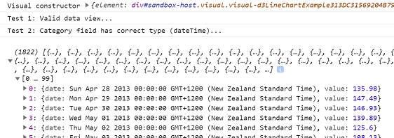
This means our visual is processing the dataView as intended and can see the data how we want it.
Wrapping-Up
We’ve covered a lot of ground today and (assuming everything’s working), we should have a better understanding of the following for this particular scenario:
- How our
dataRolesconfiguration impacts the fields displayed by our visual. - How our
dataViewMappingsconfiguration handles eachdataRoleand adds it to thedataView. - How to increase our row limit for the visual.
- Where to find our data in the Developer Visual’s
dataView, and how categories and values correlate. - Cleaning up the boilerplate code, ready to start development of a new visual.
- Defining a simple
interface, to dictate to TypeScript how our data should look when we map it from thedataView. - How to test our
dataViewfor some simple conditions and fail gracefully if they aren’t met. - How to substitute the d3.js
csvfunction (for loading remote data) with swapping this out for the data in ourdataView.
That should be enough for today!
At this point our custom visual isn’t doing anything exciting visually, but as discussed above, we’ll handle porting across the elements and plotting logic in part 2.
See you soon!
DM-P