
Making a Range Column Chart in Power BI with the Violin Plot Custom Visual
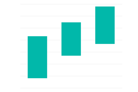
One of the cool things about Power BI is seeing what you can do with custom & core visuals beyond the happy path, and I’ve been able to explore this a bit with one of mine.
With version 1.3.0 of the violin plot custom visual, one of the additional features was a new type of combo plot to show the range of values from minimum to maximum. When testing, I got a little excited about the possibilities, and as I sit here on a rainy Auckland afternoon, I figured I’d write this one up.
Before we Start

This is not the intended use of the visual, so it's more of an exercise into the how we can push it a bit. I'm not intending to support any scope creep away from the core purpose of the violin plot. Anything specific to this type of chart should probably be its own custom visual, and I am working on one of those at a somewhat glacial pace. No ETA on that one yet.
Also: this tutorial assumes that you know how to use the violin plot and understand its functionality around how data needs to be structured. You might want to play a bit further before proceeding, as your mileage may vary if the data you're feeding into it doesn't have the correct level of granularity.
For anyone who’s ready to continue, let’s get started.
Setup
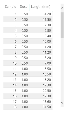
I’m just going to use the ToothGrowth dataset that’s included with R, but as long as you have a field you can use to uniquely identify the grain (and a category if you want one) then you’ll be fine. To confirm how this looks, here’s how it looks as a table in Power BI:
Step 1 - Data into Visual
After adding the Violin Plot visual from the marketplace into my report, add the fields to the appropriate data roles, e.g.:
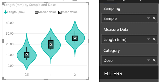
So far, so… violin-y. We’ll start making some changes.
Step 2 - Violin Options
We’ll “de-violinify” the plot by amending properties in the Violin Options menu:
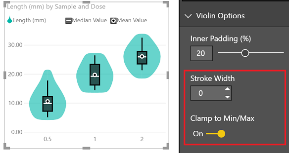
- Change Stroke Width to 0. This hides the violin border (KDE plot).
- Change Clamp to Min/Max to true. This ensures that the Y-axis will work with the min/max values of your dataset, as KDE plots often produce a ‘tail’ as an artefact, which can extend the y-axis in many cases, and we won’t need that with a column chart.
Step 3 - Data Colors
To remove that pesky KDE plot completely, we need to hide the rest of it by using the Data Colors menu:
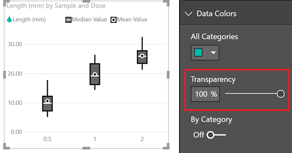
- Set Transparency to 100%. This will lovingly blend away the KDE plot fill.
Hey… did you notice we pretty much have a box plot now? So many possibilities! But we’re already covered for these visuals, so let’s press on…
Step 4 - Combo Plot
We’ll now need to update some options in the Combo Plot menu, e.g.:
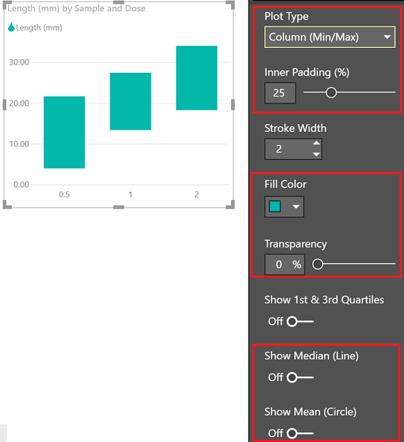
- Set Plot Type to Column (Min/Max). For variety, you could use Barcode (Strip) to get a standalone barcode plot rather than a column plot, similar to the standalone box plot in the previous step. I’ll continue to focus on the objective of this post though!
- As the plot has padding for both the violin and the combo, set the Inner Padding to a lower value such as 25% to give the columns a bit more room in the chart.
- Set Fill Color as desired.
- If want a solid fill, set Transparency to 0%, otherwise you can leave this as-is for the bordered look.
- I’ve also switched off Show Median (Line) and Show Mean (Circle) for simplicity, but you could leave those on, or enable the quartiles to further annotate your series, if you do actually want to leverage those features.
Step 5 - Legend
As we only have single colour for our data, if we’re not using the other statistical indicators, such as mean and median, we may want to use the Legend menu to tweak further:
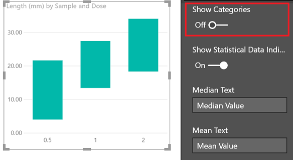
- Set Show Categories to false.
- Note that as I’m not showing the other statistical indicators in the Combo Plot menu, the visual will free up the empty space, even if they are enabled.
Wrapping Up
This is one possibility that options offer - as mentioned higher up, you could produce standalone combo plots for the other types (box & barcode), or modify the other properties to tweak further. It’s not going to set the world alight, but may give you a couple more possibilities when visualising your data.
Have you done anything particularly inventive with the violin plot? It’s always great to hear if people are using it or finding it useful, so please let me know if you have! I’d be really excited to learn some new tricks or see if there are further opportunities for the visual.
Thanks for reading!
DM-P