Deneb Now Available for Public Preview

It’s been a pretty awesome month for folk who want more visualisation opportunities in Power BI - we’ve seen the launch of PureViz Infographic, and last week Microsoft announced the Charticulator visual.
If that’s not enough to be getting on with, a short while back I mentioned I’ve been working on the idea of bringing the Vega and Vega-Lite languages into Power BI. For anyone who wants to get started, it’s now available for public preview 😀
The latest version of visual can be downloaded at deneb-viz.github.io, along with supporting documentation for current functionality.
I’m doing an intro session this week at the Power BI Summit for anyone who is attending and would like to know a bit more, but for those that aren’t able to attend, I’ll provide a short overview below.
A Little Bit About Vega
To borrow the high-level summary from Vega’s website:
Vega is a visualization grammar, a declarative language for creating, saving, and sharing interactive visualization designs. With Vega, you can describe the visual appearance and interactive behavior of a visualization in a JSON format, and generate web-based views using Canvas or SVG.

And if Vega seems a little too high a barrier to entry, there’s also Vega-Lite, which is easier to get into, but still very powerful in terms of producing good quality visualisations:
Vega-Lite is a high-level grammar of interactive graphics. It provides a concise, declarative JSON syntax to create an expressive range of visualizations for data analysis and presentation.

I would recommend Vega-Lite to begin with, and it’s the default language for new instances of a Deneb visual.
Both languages are from the work at the UW Interactive Data Lab, and it’s many alumni and contributors who continue to evolve it. It’s built for the web, and therefore a great fit for a tool like Power BI, without the need for inventing another proprietary language.
This flips the “Power BI way” of doing things on its head: rather than picking a pre-defined chart and working with only the options available via the properties pane to customise it, you can instead work with the data you want and design a visual from the ground up. You can then iterate your design as you explore your insights. If you’re developed visuals in Power BI using R and/or Python, you may have used libraries like ggplot2, plotly, seaborn or others to a similar effect.
What Deneb Does
- Packages-up both Vega and Vega-Lite parsers and runtimes. You just need to specify which language you’re using in the settings tab. There’s also no external dependencies, like there are for R and Python visuals, so if your visual works for you, it should work exactly the same for all your users.
- Binds columns or measures you add to the visual as a named dataset. For consistency with the R and Python visuals, this is also named
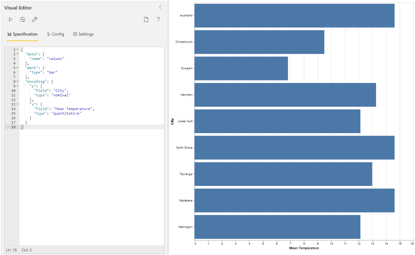
dataset. You can read more about the inner-workings of that part on Deneb’s site. - Provides an editing environment for a JSON specification. There’s an editor for the main specification, and another for the top-level configuration (which allows you to abstract some of the cosmetic elements of your work).
- Provides (some) interactivity bindings with Power BI. And hopefully more later on. Right now, we have tooltips working. Under the right conditions, report page tooltips work as well.
- Provides Some In-Built Examples so that you can have a go at some simple visualisations straight away. You’ll be able to map columns and measures to placeholders and embed these into the specification as references. Soon, you’ll be able to create your own templates that others can import through a similar mechanism.

We Have Charticulator Now - Why Would I Need Deneb?
Good question! Charticulator is a well-implemented grammar of graphics UI, which is an incredibly rare thing to come across. I’m a huge fan of it, and I hope you find it as useful as I do… I’m certainly going to keep using it in my work 😀
With it being interface-driven, we might sometimes be limited by what the interface exposes to us. It’s more extensible than the core visuals but we still might hit a wall when we want to do something very specific.
For anyone who has hit the aforementioned wall when, say, transforming data in Power Query, you can jump down into the advanced editor and write directly in M. The conventional visuals and Charticulator don’t have a capability for this; going to the low-level or ‘pro mode’ visuals in Power BI requires you to learn the visuals SDK, which can be a lot for people to take on for a specific use case.
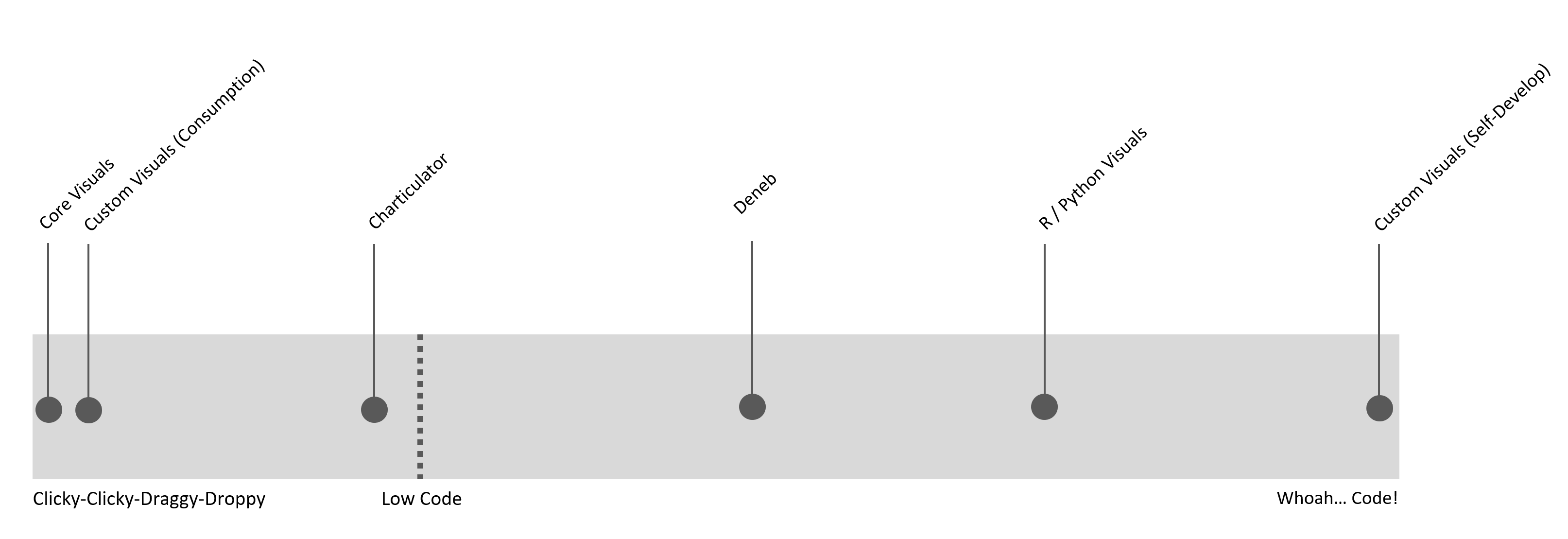
If I think about how straightforward visual solutions are within Power BI in terms of effort or cognitive load for you as a creator, I see Deneb as an additional pillar in the bridge between conventional visuals and R/Python (with full-on visual development all the way over the other side):

You will be able to dig deeper in terms of what you can do with a visual design, at the cost of having to use an editor rather than an interface. As JSON is a data structure rather than a programming language, it is more intuitive for data folks to work with. And because Vega is also used much more widely than within Power BI, it’s also possible to dip into a much wider pool of examples and knowledge online, if you’re learning.
Vega can also do things like transformation of your input data to do statistical analysis, much like R or Python. Here’s a live example - we haven’t had one of those in this post yet:
In the above report, we start with something simple, like a measure and a sampling column to get the right level of grain, and then produce a distribution plot with some data-driven annotations based on the aggregates of these transforms (page 1). We can re-use the specification for unique values of another field to produce facets or small multiples (page 2). In our example, there’s quite a bit of geographic variability that the summary-level visual doesn’t uncover, but once we have our design, it’s very straightforward to add this context within the same specification. I’ve also added a line to track mouse position and display a tooltip.
If you’re keen to see the inner workings of this one, here’s a link to a Gist containing the raw specification. I built this visual iteratively, starting with a simple density plot example, and layering-up up the functionality and theming to communicate particular my data story.
What’s Next?
I appreciate that downloading a visual from a website is not ideal for a lot of folks. I want Deneb to be available in AppSource and I’m developing it with a view to certifying it when it does get submitted. This hinges on the assumption that the latest rules will allow it to happen, but I’ll do my best to get it over the line.
Firstly, I’d like to make sure that the preview works well for a wider audience before I start the AppSource process, which is why I’m starting with this public preview. If there’s anything that we need to iterate quickly on, the submission, review and publication process through AppSource is a little more onerous than this allows.
I’ll also be looking to get more functionality chipped-off before then:
- Ability to generate a JSON template that can be imported by other users
- Additional APIs for Power BI interactivity, such as data point selection and the context menu
- …and anything else that comes up and needs addressing
So, there’s still a little bit more to do before we get to general availability through AppSource. Although, it has taken me a long time to get to this point, and I’m incredibly grateful for the support of Jonathan Kapoor, Kerry Kolosko, Mike Carlo, Reid Havens, Tom Martens & others for their willingness to alpha test Deneb and provide valuable feedback.
And now it’s your turn to have a go - I hope that the results of our work can help you with yours. And, if you have anything cool you want to show me, please let me know! The whole point of Deneb is to allow people to unlock their creativity within Power BI, and I’m really looking forward to seeing what comes next 😀
All the best,
DM-P