"Deneb" Prototype Dev Log: 0.1.0.70
For the uninitiated, “Deneb” is a prototyping exercise. The idea is to try and embed the Vega, and/or Vega-Lite tooling into a Power BI visual with some editing tools. We can hopefully give creators a new way of building their own custom visuals within a Power BI workbook, using JSON to create specifications - in much the same way as Vega Editor, but with a dataset linked to the supplied columns and measures from the data model.
Last update showed some decent progress, and I’ve certainly been busy over the last month or so. My initial goal of end-January from something “beta-able” has been hindered by having to stop and learn Redux, as well as a couple of work commitments. However, things have moved on sufficiently, that I think it’s time to let anyone who is interested to see where we’re at.
Sample Data and Visual
For the purposes of illustration, we’ll be working with a simpler visual than previous examples, so that we don’t add reams of JSON to this post. We’ll use a simple column and measure combination from our data model as follows:
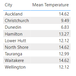
This is showing the Mean Temperature for all values of City in our data model. We’ll use the visual to produce a simple bar chart, and because the bar chart is already a core visual, we’ll do something weird to ours that the core visual can’t do, like give it rounded corners:
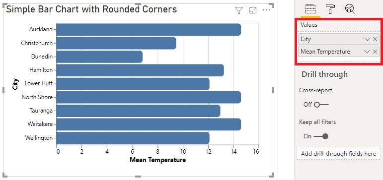
As we can see, we’ve added the City column and Mean Temperature measure to the visual’s Values field, much like we would do for a table, R or Python visual.
And how did we actually build the bar chart? Well, in the Visual Header we click on the ellipsis and choose Edit to open the Visual Editor, like so:
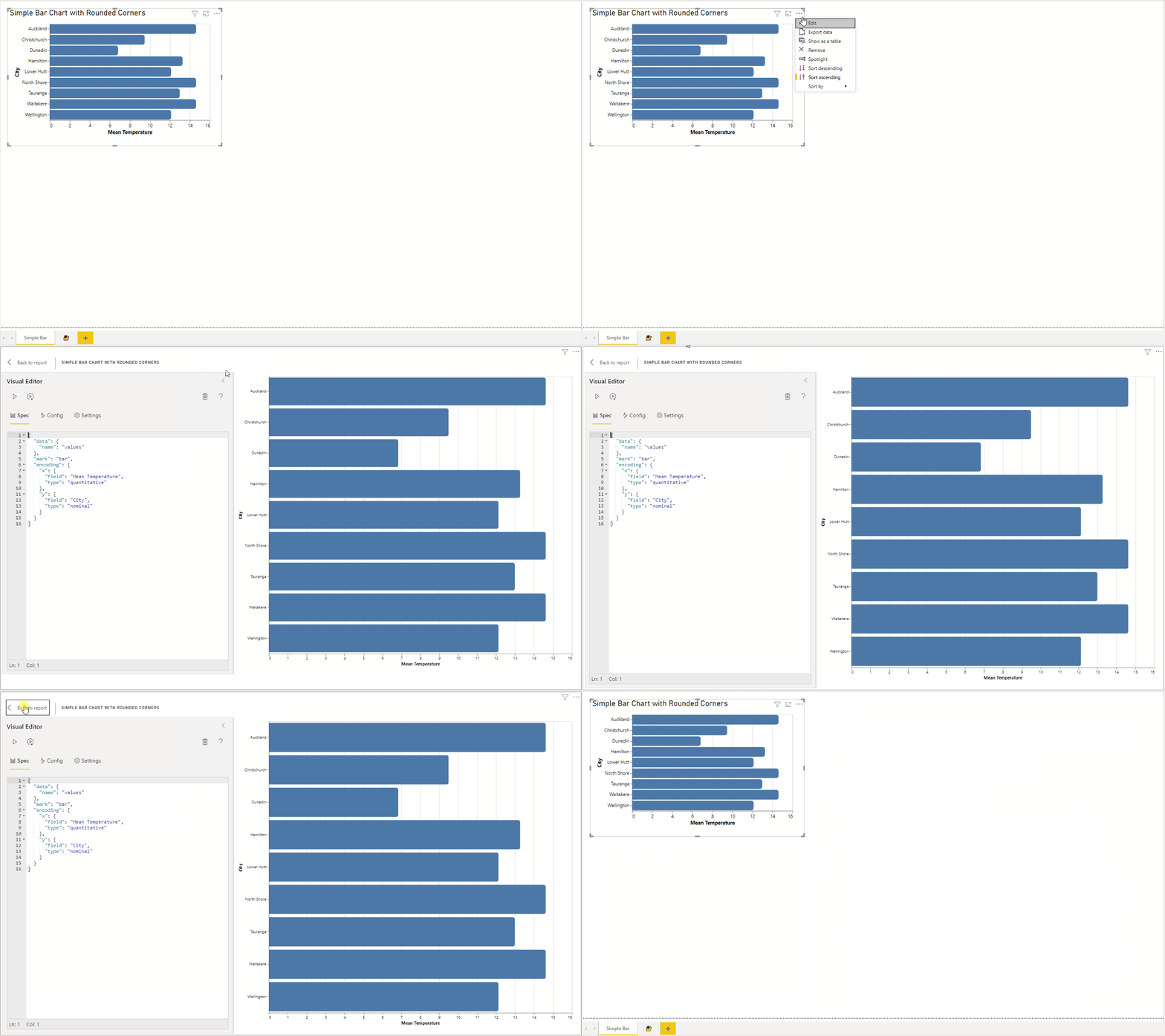
We’ll cover the how’s a bit more as we continue on with the post.
Revised Interface
First-up, the majority of the Visual Editor’s interface has been re-worked, and (mostly) implemented using Fluent UI, for a more in-keeping look.
The icons at the top will:
- Apply Changes
- Auto-Apply Changes (as you type)
- Discard the visual’s current Spec and Config
- Provide help (TODO: write help)
It’s likely there will be a few more icons added to this part of the UI as some more operations get folded-in.
The panes underneath will provide access to…
1. The Spec Editor
This allows us to write our visual spec, which is in JSON. We have the following in our example, which will create the simple bar:
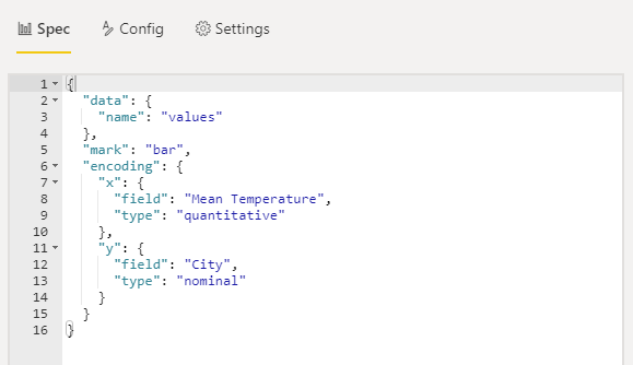
This is a simple Vega-Lite specification. To access the visual’s data, we declare a named data source called "values". This will map any columns and measures by the name supplied in the Values field, and we can see that the "x" and "y" encodings have these references, and this will bind the data accordingly.
2. The Config Editor
The Config editor allows you to seperate out your top-level configuration of the visual view from the Spec, should you wish to do so. The Spec and Config are merged together when changes are applied to create the full view. Here’s what this looks like for our example:
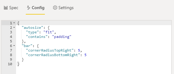
Here, we’ve specified autosize properties, which we can use to automatically size to our visual container and saves us a lot of work for simple visuals that use a single or layered view. More complex plots will require specific height and width info.
We also have applied the radius properties to our "bar" mark, so that the top-right and bottom-right corners are rounded.
Note that you can still add a
"config"property to the Spec and use that if you want to keep everything in one place.
3. Visual Settings
This tab allows you to configure a couple of Vega-specific options:
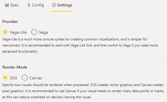
Here, we’re able to specify whether we want to use Vega-Lite or Vega for our spec format. The Spec editor will validate your JSON accordingly and render the visual using the selected provider.
We can also specify whether the Vega tools render using SVG or Canvas.
One More Thing…
For the last couple of posts, I’ve been toeing this particular line:
To manage your expectations: because this tooling is so open-ended it is highly likely that we will not be able to interact back with other visuals. Cross-filtering, highlighting, drillthrough, report page tooltips etc. have to be implemented with a very fixed idea of what the data structure inside a visual looks like, so that Power BI can perform the necessary lookups between its data points and those of other visuals in a report. As such, the cost of flexible design and implementation currently has some limitations, but I will see if I can do anything about this further down the track; certainly not for a v1 of the visual though.
Well, the Settings pane in build 70 also has this additional section:
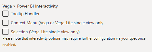
Enabling these will allow you to utilise that particular interactivity function of Power BI, with some caveats:
-
The Vega and Vega-Lite tooling is incredibly configurable, so there are going to be many use cases that don’t work, because I’m not able to test them all. We will need to look at these on a case-by-case basis and see how we can potentially support them.
-
I’m doing as much as I can behind the scenes when your view is generated but due to the flexible design potential, there might be some additional setup required in your spec. This is due to how the Vega tooling works, and what you might want to do as a creator (I will highlight these requirements in each section accordingly).
-
Any mark that you wish to apply interactivity to needs to resolve to a “pure” data point. This means that if you apply any transformations that mutate the data point, we can no longer tie it back to the corresponding context in the data model.
While this is not 100% in-line with core visuals, it should certainly provide much more flexibility over R and Python visuals when it comes to building a bespoke design.
Tooltip Handler
Enabling this setting will load a purpose-built tooltip handler that overrides the Vega default and will attempt to reconcile data points back to Power BI.
You will need to enable a mark for tooltips for Vega/Vega-Lite to display the tooltip on hover. For our Vega-Lite example, we can do the following in our config (or spec):
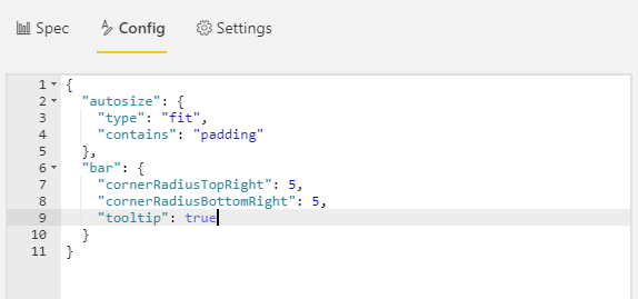
For a Vega specification, we can add the following to a mark’s "enter" encoding:
1
"tooltip": {"signal": "datum"}
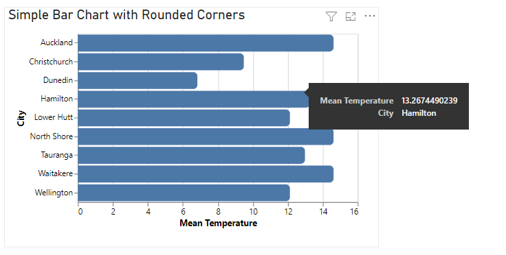
When the changes have been applied, we can hover over any enabled mark and we’ll get a Power BI tooltip, e.g.:
Now for the cool part - if you’ve built a tooltip page with any of the columns in your dataset (and provided the data point is “pure”), the handler will be able to resolve it, e.g.:
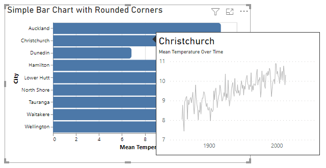
If you have transformed a data point in the specification and enabled it for tooltips, the visual will at least display a standard tooltip of the transformed values.
Context Menu
Enabling this setting will display the standard Power BI context menu when you right-click a data point. If the point is “pure” and a suitable drillthrough page exists for one of the columns in the dataset, then you are able to drill-through, e.g.:
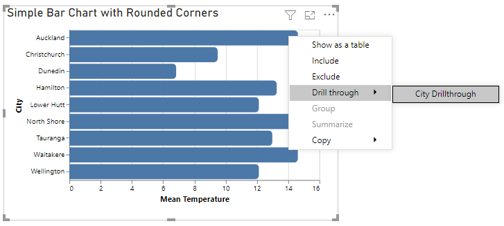
For Vega-Lite specifications, this currently only works for those containing a single view. I’ll be working to sort this out for more complicated specifications, as this is the primary use case for the visual. Vega specifications tested so far all seem to be okay.
Selection
Enabling this setting will enable a data point for selection (providing it is “pure”). Clicking, or Ctrl + clicking data points will cross-filter other visuals, e.g.:

Note that our example isn’t providing any visual cues, and this is because I can’t predict what you as a creator want to do here. So, you can configure your mark’s encoding to leverage a special selection named __select__ as needed, e.g.:
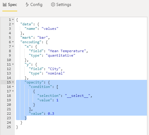
Here, we’ve added an encoding on our mark’s "opacity", which will ensure it’s 1 (fully opaque) if selected, or 0.3 (30% opaque) if not. Now, we can take another go at this, e.g.:

Selection state for eligible data points can also work with bookmarks, e.g.:

The selection functionality is very much a “from tiny acorns…” type of feature. Much like the context menu, this only supports a single Vega-Lite view at present, but I’ll be looking to see how I can extend this to more complex plots, as similarly this is where we would want to try and leverage this kind of functionality if possible. There are still a few UX gremlins as well, but I’m pretty happy that things are moving in the right direction 😊
Want to Have a Look?
Here’s a sample workbook with a slightly more customised version of our sample bar chart, and is probably best being played with in full-screen view. You can try interacting with it to see how things are going - there’s a tooltip page and a drillthrough page, and some bookmarks. The drillthrough page also has the latest version of another chart that has appeared in previous posts, and is also built using this visual.
I’m planning to focus more on adding the remaining features over the coming few weeks, so hopefully we can get this out to a wider audience for beta-testing very soon.
Thanks for reading! Until next time,
DM-P