Creating Blank Table & Matrix Headings in Power BI
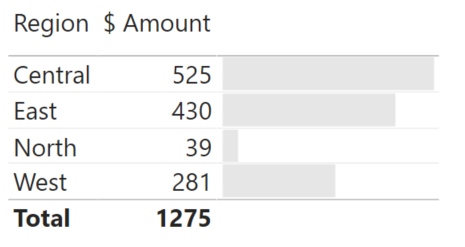
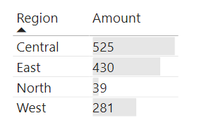
I love the conditional formatting in Power BI tables and matrices, particularly when it comes to data bars - they’re a great way to produce space-efficient visuals. What I’m less of a fan of is when you combine labels and bars in the same cell, and you can’t easily resolve the size of the bar from the number:
In situations when the label is outside of the bar, this is perfectly legible. However, when the label is entirely inside the data bar, or it spans the boundaries (such as in the Central and East categories above), it gets a little trickier.
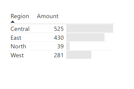
We can make changes to the text colour or the data bar colour, or even the alignment of the value, but this is currently an all-or-nothing approach. For instance, the following looks pretty good:
Now, let’s say we’ve started up a North region, and as they’re an emerging market, their sales are a bit lower:
The lower value results in a data bar that sits behind the text and it can be seen, but can take a little more effort to resolve.
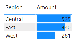
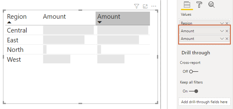
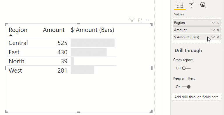
What might be nice, is if I can separate the label from the bar, so I can control elements of both. We might think this can be done by adding the measure again to the list of fields in the table. As this has the same ID in our model as the measure we’ve previously added, we basically get the same column again in our table and this will respond to any changes we make to the other, e.g.:
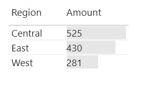
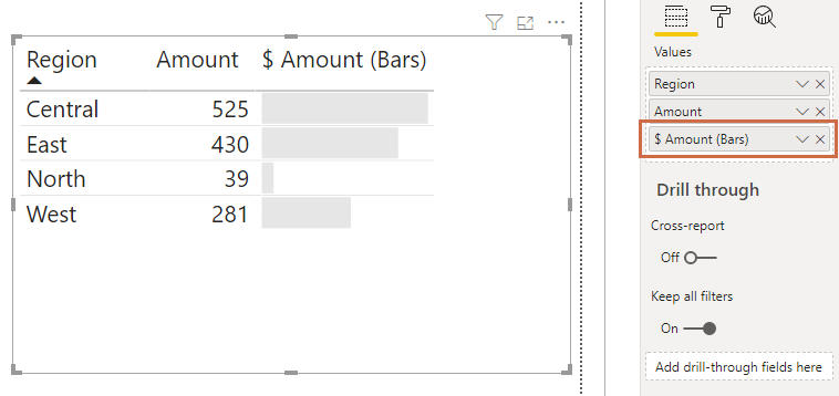
We can work around this by creating a new measure that is a duplicate of our existing one, e.g.:
1
$ Amount (Bars) = [$ Amount]
EDIT: there’s some additional things you can do with the measure to prevent the total being displayed in the table if you’re using them. Refer to the appendix down below for this.
This is looking better, but that column heading for the data bars looks redundant. It would be ideal if we could remove it. We can’t condition its visibility at this time, but there are a couple of approaches we can take:
Option 1: Format Column Heading
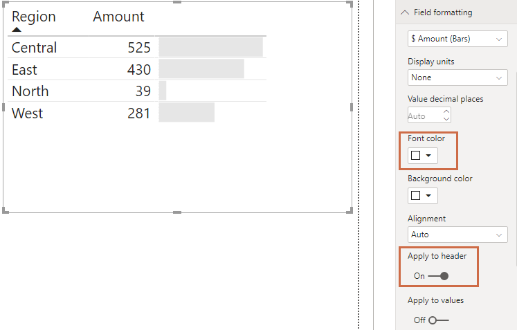
Fortunately, We can modify our heading for this column to match our background. In my case, this is the same as the report, e.g.:
What we did here was:
- Selected the Field formatting menu from the visual properties
- Selected the $ Amount (Bars) measure from the dropdown
- Set the Font color to the same as our visual background -
#ffffff - Set the Apply to header toggle
Option 2: Exploiting Unicode Whitespace
The other option is a little more of a quirk, and may be fixed later on.
It might have occurred to you to try renaming the measure to [empty], or putting a space in the name, but Power BI will helpfully prevent this, e.g.:
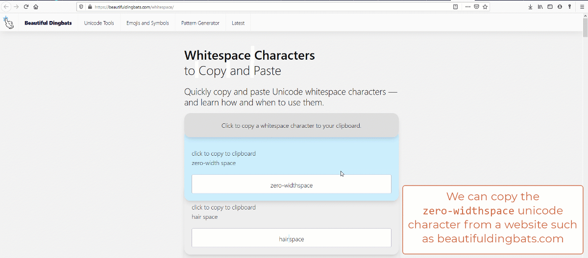
There is a loophole to this: we can insert a zero-widthspace unicode character as the renamed measure. This is not easy to type directly, so we can obtain from a website such as qwerty.dev and paste it into the measure name for the visual, e.g.:
It’s worth re-stating that this second approach works currently, but may be shored-up in future, as it’s exploting Power BI’s sanitisation of the measure name for the visual. While the first approach is the more ‘correct’ way to manage this in Power BI, the latter may be something you can add to your toolbox when looking for creative solutions.
Until next time,
DM-P
Appendix - Handling Totals
Since publishing, I’ve had this very useful feedback on Twitter:
Good idea. @the_d_mp Might be worth updating your blogpost to show how to use IF(HASONEVALUE to accomplish this in need. pic.twitter.com/5qRbTIeDl3
— Jeff Weir(d) (@InsightsMachine) April 13, 2020
If we enabled totals for our example, this would currently look as follows:
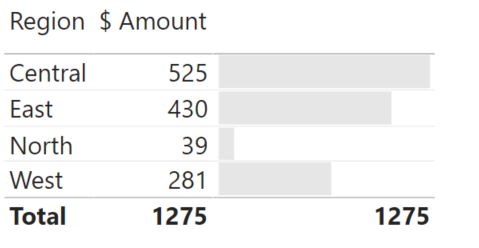
Conditional formatting for totals is on the roadmap and should be with us soon, but we can fulfil Jeff’s wishes by modifying our measure to consider the context we are in so that it doesn’t display at the total level. For our example, this would look as follows:
1
$ Amount (Bars) = IF(HASONEVALUE(Data[Region]), [$ Amount])
Our table now looks a quite a bit nicer as a result, e.g.: