Power BI, the Violin Plot and Data Grain (Sampling)
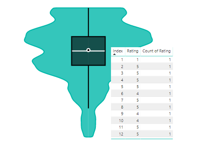
How to correctly structure your data for using the Violin Plot (and a general lesson about aggregation within Power BI).
4 posts · All tags
How to correctly structure your data for using the Violin Plot (and a general lesson about aggregation within Power BI).
Taking an existing example for d3.js and applying to it Power BI as a custom visual. Part 2 handles the visual elements of our chart.
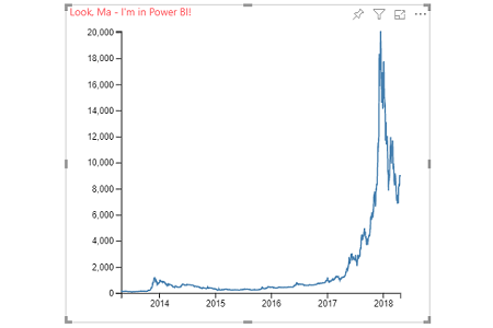
Taking an existing example for d3.js and applying to it Power BI as a custom visual. Part 1 handles mapping from the dataView into our custom visual.
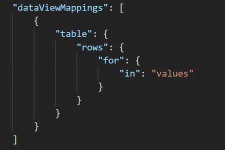
How to set up and work with a simple `table` DataViewMapping in the Power BI custom visuals SDK.